Wednesday, October 28, 2009
Comic 655: Trickery
I was hoping that today's strip would be either truly awful or surprisingly good. Unfortunately, it isn't. And that's a trend we see a lot in xkcd - a stunning mediocrity that leaves the reader with no feelings whatsoever about the comic.
Either way, I'll split this up into 3 sections : The Criticism, the suggestions, and the praise.
The Criticism:
To start us off, we have another instance of the head not being attached to the body in panel 1.
The setup for the comic isn't so bad - we see a man rock climbing, plenty of opportunities to go from there -... And then in the very next panel, we see pieces of someone. Please - don't give away what's going on in the second panel when you're aiming for a big surprise. I'm biased though, having already seen the fourth panel - it's entirely possible that someone reading it for the first time could mistake the leg and face for that wooden post that is the goal in kids' rock climbing course.
Speaking of a kids' rock climbing course - that's what this is supposed to be a picture of. This stick-man is using the almighty power of slanted photography to make it look like he's climbing a kids' rock climbing course. Who among you would be truly impressed by that? Why would anyone even want to post pictures of themselves climbing a kids' rock climbing course?
Admittedly, the fake picture would be made a lot more impressive by the fact that he's not using a belay (the device that clips to a rope/pulley system and supports your weight), except for the fact that professional climbers, the kind who climb Mount Rushmore [people climb mount rushmore??? -Carl], would still use a belay on a kiddy rock climbing course because most of them aren't fans of falling. I know I'm nitpicking, as it's supposed to be a falsely impressive picture, and, you know, the character isn't actually climbing.
And finally, we have the alt text. This alt text wouldn't be so offensive if the comic it follows was actually good. But it isn't - it's mediocre. And in the same way, the alt text itself is mediocre. It's a problem I feel we see a lot in xkcd - the alt text continues the already boring conversation. If the alt text is a followup to an interesting/funny conversation, that's great - but in this case, it would have been far better as a random observation - or perhaps a callback to some of the old alt-texts, with Mr. Munroe (Randall?) making a comment in the first-person about similar situations/what he would do in the situation.
Either way, it all wraps up with a mediocre punchline that doesn't add much to the comic - even omitting all the words and keeping just the "art" that's currently there would make for a better comic.
I'm worried that I'm criticizing just for the sake of criticizing - but I hope I've raised at least a few valid points.
The Suggestions:
Put the head on the body in the first panel.
Erase the girl in the second panel - although, admittedly, if she just appeared in the third panel, that would be a little weird. I stand a bit divided here, I guess.
Give some funny alt-text.
The Praise:
Well, I guess more effort was put into the first panel than Mr. Munroe (Randall?) usually puts in. Really, the first through third panels aren't that bad. They set up well for an interesting punchline or a funny wordless comic. Also, the situation presented is kind of funny-interesting, with someone faking rock-climbing to impress their friends.
I guess that's all I can say =\.
===========================
Carl again. My own take on the comic was that it was an exceedingly old joke (I recall it being in an old Mad Magazine batman parody...from the 50s. And I'm sure it was old then, too) rather blandly executed. To all those people who suggested that a far better joke would have been to have a guy who goes to rock climbing walls, sets it up so he is standing out from the wall, and thus makes real photos of rock climbers look fake - that is a great idea. That would have been awesome.
Who is impressed by pictures of rock climbing? I went rock climbing some times. I am not a sporty person. I went to like, rock climbing birthday parties when I was like, eight. Why would you be impressed by that facebook picture?
Sunday, October 25, 2009
Comic 654: Disrupted
----------------------------------------------
So a lot of people have been troubled by what I wrote up there, so now I'll explain why I didn't like his Geocities redesign, and then talk about the comic itself.
Visitors to xkcd on Monday were greeted with this (click for a big version):
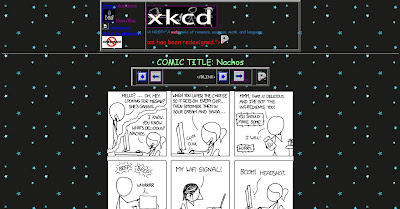 You can see that something is a little...different, no? Eventually the scrolling red text informed you that this was in honor of the last day that Geocities, home to a myriad of crappy websites that middle schoolers made in the 90s, was going off the internet. Tear, tear. So, to honor it, Randall made a crappy geocities style website.
Lots of people thought it was funny, so I am going to go ahead and admit that maybe my hatred of xkcd is getting in the way of me enjoying this. But all I could think was "this is so OLD." Lots of people make fun of that style of crappy website. Strong Bad was doing it years ago, that is the example that I first thought of. Here, watch his explanation of how to make a website, or just see the website he made. Basically the same thing. You could also see H*R's april fools "under construction" page, which I feel is related.
Ultimately, this is just playing to his fans nostalgia for their own crappy old websites, or their friends'. But it's just annoying. The fact that you are being annoying on purpose does not make it not annoying. Not in the least.
Lastly, I would have, if not enjoyed this concept, at least appreciated it more if it had not been connected to Geocities' demise, just done as a random prank. Like when Pictures for Sad Children was sponored by Long John Silver's. (ps if you know of a better picture of that or even a whole mirror of the sponsored pfsc site, do send it to me).
Anyway, let's move on to the comic itself.
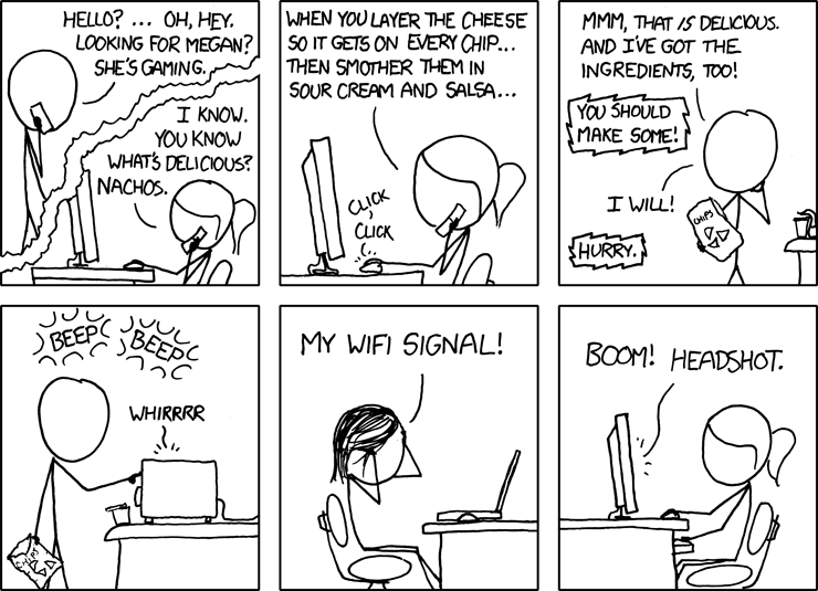
At first, I thought that this comic, the centerpiece of the crappy website redesign, was being deliberately obscure and strange. But I gues I was wrong. I thought it was supposed to be an unholy amalgam of all those xkcd tropes - megan, gaming, internet service, nachos - that we have come to love so well, but apparently not. Apparently "my wifi signal!" is how people react to losing their internet service in Randall World, and "She's gaming" is how you say "she is playing a game" or just "she is busy."
Anyway, I guess the idea is that she gets him to use the microwave in order to fuck with the wifi signal and beat her opponent. Clever, I suppose, if we were told how the hell she knew which ingredients he had and if a microwave in the other room would actually mess that stuff up, or if a serious gamer relied on crappy wifi.
The whole thing is just so obscure and random and concolvuted, and hard to figure out what is happening, that it really seriously fails.
Comic 653: So Bad It's Worse
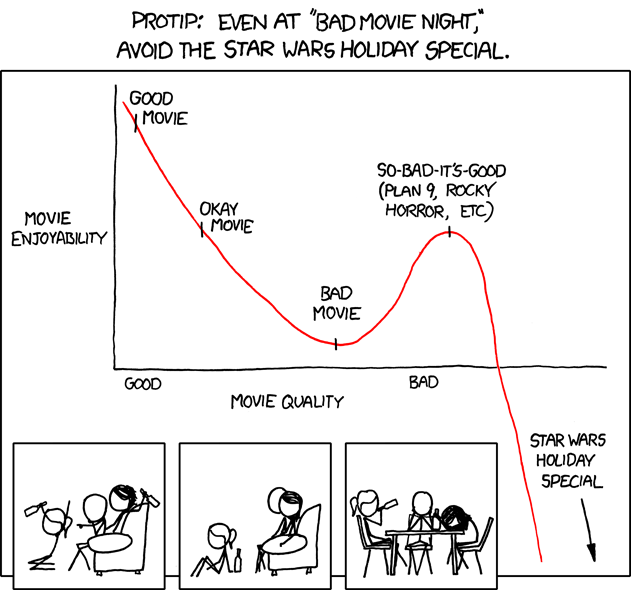
The Star Wars Holiday Special is a bad, bad piece of filmmaking. Very bad. So very, very bad. You should probably read the quotes on the Wikipedia page about how it was received. But it is so bad you could just see that the first subcategory under "reception" is "regrets."
Not that I have actually seen this movie, mind you. I, star wars nerd though I am, haven't really cared enough. But the point is, I've been hearing about how terrible this thing is for a long, long time. So we get that it's really, really bad. really bad.
---------------
Today's xkcd is based on the fact that the star wars holiday special is really, really bad. It tells us this right off the bat: "...avoid the Star Wars Holiday Special" it says. Because it is so bad. Even for bad movie night! Not so original a comment, but whatever.
In case you don't understand "Avoid the Star Wars Holiday Special," he makes a graph for you. As movies get worse, their enjoyability, for a time, gets higher. But the Star Wars Holiday Special is not good! It is not enjoyable! It is, in fact, bad! Really really bad! So it is at the bottom of the graph! Do you see? (to Randy's credit, unlike previous efforts, this chart is easy to understand, logical, and does a good job conveying the intended message. nice work!)
"But," you are thinking, "I don't understand. Is he saying the Star Wars Holiday special is good? Or is he saying it is bad? Please do not use words to tell me the answer, because I do not understand words, and do not use fancy graphs, because they are too fancy for me. Please use only non-verbal stick figures." Luckily, your pal Randall has got you covered. Sure, the little pictures at the bottom don't exactly fit in the box, but whatever! You can see that they do not enjoy the Star Wars Holiday Special. They have to drink alcohol to stop them from being sad. They are sad because the Star Wars Holiday Special is bad. So very, very bad.
That is the comic.
"But wait", you say again. "I do not read the comics. I read only the alt-texts of the comics. How will I know whether the Star Wars Holiday Special is bad or not?" Again, got you covered. The alt-text, "You think it's so legendarily bad that you'll torrent it and sit through it just for the kitschy nerd cred. I, too, once thought as you did." tells you clearly: Star Wars Holiday Special is bad. How bad, you wonder? So bad! So bad that even if you think it will be good, it is is bad. That is what the alt-text has to say, about the Star Wars Holiday Special.
------------------
Did you like how he included two "so bad they are good" movies by name, to prove his nerd-cred? He didn't mention any good movies, or any bad movies, just the really terrible ones. And to further prove his nerd-cred, he chose two that he could refer to by "in the know" nicknames. So clever! He must clearly be a fan of Plan 9 From Outer Space is he just calls it "Plan 9".
-------------------
I just want to point out that lots of things are so bad that they transcend the usual so-bad-it-becomes-good phenomenon. My favorite example is this book, which, despite the fact that it looks like it will be hilariously bad, is, in fact, boringly bad.
------------
You know what else is bad? The Star Wars Holiday Special.
------------------
Also, it was bad that Moe didn't update for so damn long but now it is back THANK GOD and hopefully it will not keep taking these long, long breaks in the future. Luckily the author apologized for taking so much time off from the comic.
-------------------
The Star Wars Holiday Special is baaaaaad. so very bad!
swhs = bad.
Thursday, October 22, 2009
Comic 652: Who would have thought explosions would be so BORING?

The art in the explosion is pretty cool, I guess, but the weirdness of the girl in panel two makes up for that.
I guess the point is that when the movie first came out we didn't have unmanned planes that could blow stuff up, and now we do, so real life is even more terrifying than the dystopian film. Whatever.
I get to pass on comics every once in a while and this will have to be one of those times. The fact that you all are still discussing the airport security comic and not this one is proof that this is just boring.
see you next week when hopefully this mediocrity will end.
Tuesday, October 20, 2009
Comic 651: Security Threat
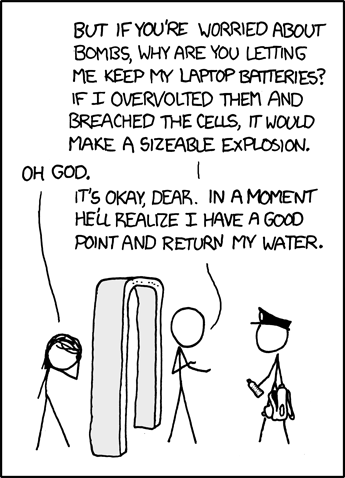
So today we learn that airline safety is actually kind of a joke. Which is to say, we are ONCE MORE REMINDED that airline safety is a joke. It's not like this is fresh comedic territory. It's not even fresh xkcd territory. Hell, the first minute of the first episode of The West Wing had a character talk about how dumb it was that he couldn't use his phone on a plane for safety reasons (alas, the clip appears not to be on youtube). Didn't Fahrenheit 9/11 have a part about how for some reason, lighters are allowed on planes? Every few months another scathing article comes out talking about how airport security doesn't really do anything, and how easy it is to cause a Major Ruckus with things you are allowed to bring on a plane. How common are stupid jokes about airport security? SO COMMON THAT AIRPORTS TELL YOU NOT TO MAKE THEM.
But whatever. I guess the whole thing needed a crazy nerdy twist, involving laptops. Anyway, this comic just treads those well, well worn comedy paths once more. "it's crazy that you can't bring water on a plane!" yeah we know. it's crazy. we got used to it, in 2006.
oh also this comic sucks because it's alt-text ["A laptop battery contains roughly the stored energy of a hand grenade, and if shorted it ... hey! You can't arrest me if I prove your rules inconsistent!"] just repeats the exact joke of the comic.
Man, aloria got some shit-tastic comics to make fun of, and I get stuck with this boring mess. I should have had her go this week.
Friday, October 16, 2009
Comic 650: Dinosaur Comics (I WISH!)

So here is today's comic, and the majority response is an overwhelming "MEH." It's not a complete comedic miscarriage like Wednesday's strip, but it is pretty heavy with the "waaaah, relationship" overtones and the boring, grey feeling that it's been done before.
Basically, if comic 15 and 584 were biologists and went on a first date, this is what they might project their prospective offspring to be (SEE, I CAN MAKE LOADS OF AWESOME REFERENCES TOO, I am a comedy genius.)
 It's sort of clever/insightful-- really, who can't think of some mind blowing activity they'd rather do than lie on the couch with their S.O.? It's also got that typical xkcd emo vibe, as boy-stick seems to be really into the relationship, while girl-stick's head is somewhere else. Now, I may be reading more into the strip than what Randall really intended to put there, but given his track record for bringing the melancholy, I don't think it's too absurd an interpretation. Overall, this strip just feels like a warmed-over mashup of "DINOSAURS! SOOOO AWESOME" and the quirky/sad relationship theme.
So, with that lackluster strip, my guest week is pretty much done. Thanks to Carl for the awesome title suggestions and to everyone for the warm reception. See you in #xkcd-sucks!
Thursday, October 15, 2009
xkcd: volume 0 - The Review
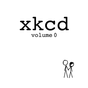
My first feeling, after reading through the book, was genuine surprise. Not that it was particularly good or particularly bad - it isn't either. Just that the things that are bad are not the things I was expecting to be bad, and the things that are good are not the things I was expecting to like.
So let's talk about the details. The book is about 112 pages long (the page numbers, as discussed below, are mostly useless). Some larger comics (442, 556, 475) are split up on multiple pages; some pages get multiple smaller comics (page "10001," for example, has four one-panel comics - 179, 191, 210, and 200, in that order). Of course, some pages fit exactly one comic. This is just a necessary effect of how xkcd uses vastly differing sizes for its comics, but the result is a little jarring - the images and text on page, say, "page 111" are huge while the comics on "page 12000" have tiny little words and pictures. Stick figures that look about the same when you read xkcd on screen grow and shrink as you read on paper.
Yes, there are annotations and little drawings and stories included in the book, but not many. Perhaps 1/3 of the pages have them drawn in (in bright red). A few pissed me off (usually of the "if you don't get this joke, here is what it is referencing" or "lots of people love this comic" variety), but a few were interesting. Particularly those where he mentions that he made an error in the original comic and had to go back and change it - not something he usually admits. What I was not expecting was the codes. There are lots of different codes all over the place - series of letters, braille, dancing stick figures, numbers, puzzle poems, etc. The page numbers, which appear to be in ternary, are also apparently part of the code. While that might be fun for some readers, for most it will just make the book unpaginated for all intents and purposes. I personally don't care about the codes - to me, they are just annoying distractions that I won't be able to or care to solve. I guess I'll just look up the answers online sometime and see how clever they are.
That said, I am generally pleased with which comics Randall chose to put in the book. Only one of my "most hated" comics - 513 - made it to the book, but a few that I really like - 284, 285, 290, 487, to choose some at random - are there as well. Some choices are inexplicable - for example, Journal 1 and 2 are there [next to each other, unlike online] but none of the rest of that story. Why have the beginning but not the rest?
Now here is where we are going to get to one of the stranger aspects of the book, something I think is a fault, and I can't think of why they did this: Though Randall is careful to mention in the book's description that every comic's alt-text is included ("discreetly," though i don't see why that is necessary), neither the title nor the date of the comics are included. The Penny Arcade and A Softer World parodies aren't labeled as such, so if you don't know those comics, you are just going to be confused. And then there are some - ok actually we're going to do this differently.
Read this comic. I've deliberately taken the title, date, and alt-text away. Now, if you happen to remember that key context, this next question isn't for you. But otherwise: did you think it was funny? Why? Just because it was a nerd playing a nerdy game?
The point I'm getting at is that this comic came out right after Gary Gygax died, and that's him in the comic (the alt-text is "RIP, Gary"). But without that information - which is not present in the book - how is a reader supposed to know that? (The same problem exists, to a lesser extent, with comic 500. did you get it?) update: the alt-text for the Gygax comic is in fact included, as are all the alt-texts. But even with that, the context is still hard to get.
That is enough criticism for now, I think. The book is nicely printed, with the few comics that are in color looking pretty good. The "copyright" page is nice, though the introduction won't tell you much new beyond the "How I got Started Writing XKCD" stuff. And I do really like the back cover.
In short, it's a book that an xkcd fan - or even someone who used to be a fan - will like, but if you are expecting much more than what you can find online, you'll be disappointed.
(update: Hey, look which book review is on twitter. if you said "this one" well yeah, that was obvious)
============
update: OH, and today's panel 5 utahraptor? I totally get your secret hidden reference. totally! but thank you for not using your obscure reference as a punchline, only as a throwaway line that people can ignore with no problems. thank you utahraptor, for all that you do.
Wednesday, October 14, 2009
Comic 649: Do Me Without A Condom*

To be completely honest with you guys, I was pretty nervous about doing an entire guest week. Everyone seemed pretty excited about it, and I was worried that I wouldn't be able to live up to the hype. In my mind, the worst thing that could possibly happen was that Randall would put out a week of mediocre strips-- not hit it out of the park excellent, but not blatantly terrible, either. Well, it looks like I don't have to worry about that today, because this strip is freaking RIPE with mockery potential.
The only positive thing about this comic is the fact that the pre-coital discussion we're witnessing is happening in the dark (though a 631 redux would have made my job that much easier.) Don't get me wrong, I like sex and pornography and naked people as much as the next sex-deprived nerd, and I'm sure the #xkcd-sucks regulars will attest to the fact that I have a pretty... erm, diverse image collection. But, seeing stick figures getting it on does mildly creep me out. Much like stumbling upon Care Bears Rule 34 hentai makes the average person squirm as they giggle, it's the combining of something typically innocent with something plainly adult that raises my hackles. There's also the fact that the guy stick in these strips tend to be interpreted as Randall's avatar, and I'd like to think only the most desperate of "gerds" want to see him getting frisky.
But I digress. If we had a bingo card full of xkcd archetypes, I think someone would be winning money today. You could ink off the following: sexkcd, unrealistic dialogue, reference for the sake of it, misunderstanding->HIJINKS ENSUE... if only Randall had managed to work in a reference to Numa Numa or something, we'd have the webcomic equivalent of a straight flush.
While rehashing popular themes does tend to make a strip predictable, it doesn't necessarily guarantee it to be terrible. However, in instances like today's strip, I'm compelled to believe Randall has some sort of Wheel of Fortune style spinner in his living room that he's been using to select random geeky things to base a comic on, then spends the rest of his time building the strip's events around it. Even viewing this as a typical "wild and crazy hijinks" style comic, the premise is still totally absurd. He wore a wrist strap to bed and a condom to install RAM? Essentially all Randall's done is swap each scenario's prophylactics. There's nothing clever about that, and aside from middle school "hehe, they're having SEX!" titillation, there's nothing funny about it, either. Setting up your protagonist to act like a moron for the sake of working anti-static bracelets into a strip does not comedy make.
If Randall really had his heart set on addressing the ESD strap as some sort of invincibility bracelet, there are a dozen better ways to do it than four black panels and stilted dialogue. Show someone wearing it while failing at a bunch of different things; for example, flubbing his presentation at a work meeting, smashing his face on the ground while skateboarding, getting slapped while talking to a girl at a bar, and so on. Or, if he were really hell-bent on incorporating sex somehow, he could have worked in a pun about how both wristbands and condoms mitigate the consequences of sudden, unwanted discharges, as one forum member quipped. Instead, the only thing this strip serves as is a vehicle for readers to pat themselves on the back for having used, or at least knowing about, anti-static bracelets. Don't believe me? Swap them out with anything else that boy-stick could have mistaken for "protection"-- shin guards, saran wrap, insect repellent, whatever. Doesn't the whole strip seem preposterous, and frankly, sort of pathetic? Well, as Mr. Munroe himself would say, Q.E.D., bitches.
*Thanks to Carl for the awesome title suggestion!
[late update from Carl: Guys, Kevin just e-mailed me this bash.org quote - with more than 1300 upvotes - that's totally the exact same thing do with it what you will.]
Monday, October 12, 2009
Comic 648: Dead Leaves
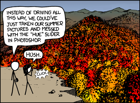
So here boy and girl stick have arrived at the fires of Mount Doom in order to destroy the One Camera...
Er. So here boy and girl stick have filled the Grand Canyon with leaves in order to have a leaf pile-jumping session of of epic proportions...
Alright, I know it's considered impertinent to criticize the art in xkcd, and I suppose it's nice that Randall is putting in a little effort here. However, it took me more than a few moments to figure out what that huge orange blob was. Even looking at it now, knowing what it is, it still looks more like a giant pile of leaves to me than a mountainside covered with trees.
Sadly, the comic is nothing as interesting as even a shoehorned LotR reference. Stick girl wants to take pictures of pretty fall leaves; Stick boy, for some reason, feels compelled to ruin the moment by pointing out you could get the same effect in Photoshop.
So, who pissed in this guy's Cheerios? This basically falls into xkcd's standard pitfall of "Randall dreams up random shit no one in real life would ever say, hijinks ensue." Really, nobody would say this, even if just for the fact that the damned hue slider in photoshop doesn't work that way.
He also makes the classic blunder of putting the only thing approaching a joke in the alt-text. Seriously! Have the girl say that snappy little comeback IN the strip, instead of "hush." Then you can have the alt be "BITCH, oh no you didn't!" and then maybe in another panel they can do a dance-off, and he can pimp-slap her, and then she can fall off the cliff and he can scream "YOU GOT SERVED" and Kanye can be like "imma let you finish" and maybe some owls ooh they're cute and also...
Sunday, October 11, 2009
Comic 647: Old

This comic feels like it just falls short of making sense, but falls short in every possible way. The fact that you are old is not "scary" even if that is sometimes the word people use; no one sits up in bed at night because they are suddenly older than they realized. Also, 8 year olds obviously don't talk like that.
I note that this is at least our third reference to 9/11 in the comic, not counting some throwaway lines, and I'm not sure that's a good thing. Obviously I am not going to say he shouldn't talk about 9/11, but using it as a default "traumatic event" starts to feel like latent Cyanide & Happiness-ism.
It's also not even the first time he's done these "oh shit i'm OLD" comics; see comic 354 or 447 [update: Or, as Daniel points out in the comments, 218] for others. Also in some ways comic 493 seems to be getting at this same idea. Yes, people get older. Yes, sometimes it can be jarring. Everyone knows this. This happens at every anniversary (the 2008 election was almost a year ago???) and it's an old boring idea.
Also, way to skip out on some cool lighting effects with the flashlight, as it is it looks like he's just about to cut a hole in his head when he turns on the lightsaber he is holding, or something.
Friday, October 9, 2009
xkcd book news
retrograde!
Thursday, October 8, 2009
Comic 646: Toilet Humor
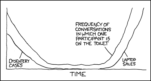
Well, for one thing, his graphing ability sucks. I know I always say that I don't like to talk about the art quality but here it really does impede the joke. The "Dysentery" line and the "Laptop" line look like they are the same line, dipping down to mirror the "Toilet" like (though I guess we should be happy that he at least spelled "Dysentery" correctly this time). Different colors would have worked, especially because then you could have put the labels in some kind of box off to the side and not have them crowding the image. He also could have made the graph easier to read by having the two lines cross at the bottom - rather than essentially meet - and that would have been more accurate too.
Also, as a lot of people have noted, there really should be some kind of y-axis label - having all three variables just sitting there just makes you wonder what, exactly, they are measuring.
And on top of that, the joke is just dumb. "People used to have to talk in the bathroom because they all had dysentery, now they all do it because they have laptops so they can" just makes me feel kind of gross. Why would it even be laptops? I don't think of IMing as being a "conversation"; I think of phone calls as being conversation (or in person talking). Why not use "cell phones" or "cordless phones" instead?
(incidentally, all xkcdsucks posting is done while on a toilet, dysentery or no, laptop or desktop, it does not matter. i will always do it on a toilet. get used to it.)
ANYWAY tl;dr: this comic is lazy and makes a stupid joke and was executed terribly with lazy art so that just made it worse.
(unlike some people, I won't dismiss graph comics entirely - they usually take less work, sure, so they can be trickier than most comics to make them worth reading, but they can still be good. For example, though i usually think Abstruse Goose is a disgusting abomination of a comic, I like this recent graph comic he made)
=====
RETROGRADE UPDATE: Aloria and I are in advanced talks to get her to write this shit next week. just so you know.
Tuesday, October 6, 2009
Comic 645: Backwards
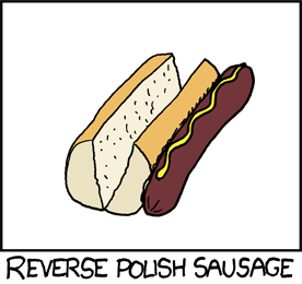
Today was one of those rare days when I just did not get it. My nerdiness failed me. Luckily, I know I am not alone. The first 7 (!) posts on the forum were all from confused people who wanted to simply tell the world, "I don't know what is happening in this comic." and I got more IMs than usual from people asking me why this comic was supposed to be funny. [PS - new favorite forumite: Brad.]
To recap what I have learned since then, the joke is based off of what is called "Reverse Polish Notation" where the operation symbol in an equation is placed after the operands which it affects. So, according to wikipedia, 2 + 3 = 5 -> 2 3 + = 5. Or something like that.
Not understanding the joke upon first reading the comic puts me at a strong disadvantage in terms of fully appreciating it, so I will not try to make a judgment on it. OK that's kind of lie: I'll say this - it looks like just kind of a dumb visual pun based on some obscure page he found while getting lost in wikipedia. Not bad, but just kind of simple and dumb.
BUT. as I said, I am not going to be able to fully appreciate this, so I will leave it to those who did get the joke to tell us what they think.
I can, however say this: While it's nice that Randall is back from his elementary science and math jokes that just exist to make 9th graders feel smart and cool, isn't it a problem of some kind if he has to go back and add a link to the relevant wikipedia page for people who don't get it?
-----------------
The fact that Moe hasn't updated since September 14th is a tragedy for all of mankind.
On the other hand, I loved everything about this MSPaint Adventures installment, the music was perfectly chaotic and sugar-rushed, matching the frenetic energy of the animation just right. I still don't think MSPA is funny but am still enjoying it slightly more each day.
--------------------
EVERYONE WHO WANTS AN ALORIA GUEST WEEK NEXT WEEK SAY "RETROGRADE"
-------------------
LATER UPDATE: golly, I totally forgot that I had submitted some comics to T-Rex Is Lonely! If you do not recall, that is the website where an upstanding gentleman named Gregor gets people to mix and match different versions of Dinosaur Comics panels 1, 2, and 6 (the ones with just T-Rex in them). When done properly, this leads directly to Fun Times and Much Laffs. ANYWAY mine went up on October 5th and October 7th. You know it's the same Carl by looking at my contributor page.
Saturday, October 3, 2009
Come Quicker! Shittier, Newer Clothes To Buy!
(before we get started, note that I have already commented on the xkcd tie and the linux shirt)
Let's start with shirts, and go top to bottom:
#1. Mr. Hat Polo Shirt. Here is what it looks like:
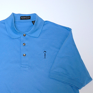 OK, basically your standard polo shirt, with the standard design in the left breast pocket area, except that it's Mr. Hat instead of like an alligator or whatever. That strikes me as a little weird, but I guess some people just love Mr. Hat. Let's take a close up look at the design:
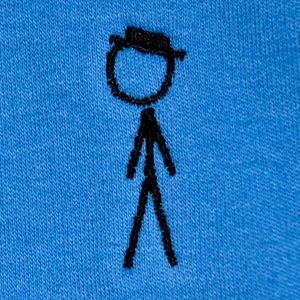 Man, when you see it like that it seems kind of pathetic to pay $48 for this, no? I mean I know polo shirts are a little expensive but given that the only added value this one has is like a few dozen stitches that basically look like someone with a not-so-steady hand used a marker to draw a stick figure on your shirt. And given that polo shirts are usually worn in slightly more formal situations, isn't a crappy picture of a stick figure the last thing you would want in one of those situations? Especially because basically no one will recognize who he is. So wouldn't it be better to just buy a regular polo shirt, find a marker, and write "I READ COMICS" on the shirt? Yes. Yes it would.
Moving on-
#2. "Woodpecker"
 This one is really quite puzzling. Like the Mr. Hat polo, this one features a design only in the top left quadrant of the shirt, and it is also mysteriously poorly done - look especially at the choppiness of the power cord itself. Do these shirts look as crappy in real life as they do on screen? Why would anyone want a product so badly made?
But this is an even more obscure shirt than the Mr. Hat one - because it references only a single (highly forgettable) comic. Given that the bird just looks like, well, an ordinary, non-woodpecking bird, I doubt anyone without knowledge of that particular xkcd will have any clue what the hell is happening on that shirt (how often will a wearer have to say something like "no no no, it's a woodpecker, get it? And it has a drill? So it can use the drill instead of its nose? GET IT? ah fuck it, you just don't get it.").
Actually, I hope to run into someone wearing this shirt just to make them say that.
MOVING RIGHT ALONG.
#3 Tech Support Flow Chart
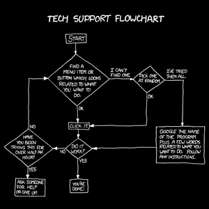 This is just the chart from this comic, though it has helpfully had most of the words that gave it context removed. Actually, I don't think this one is half bad. I only wonder how large it is printed - how close will you have to be to someone's chest to read it? And how awkward will that be?
OH GOD I JUST HAD A HORRIBLE THOUGHT.
maybe randall is secretly putting so much text on a shirt in order to encourage people to stare at each other awkwardly, from really close distances, so that Randall himself can do this without being mocked.
oh god oh god oh god i figured it out.
#4. Correlation Shirt
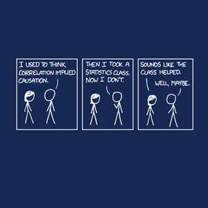 This shirt is just a comic slapped on fabric. A comic which I was pretty ambivalent about when it came out, but I think as a shirt it is even worse. Shirts should be simple. They have a a slogan, perhaps, but not a story (and this comic is a story, however simple). Glance through the topatoco shirts and see what I mean. (though some shirts deliberately subvert this....) Somehow, this concept just strikes me as very strange to put on a shirt. Not to mention lazy.
On another note, I hate how Randall feels like he has to include a stupid joke in each item description. None of them are funny, all of them feel forced. This shirt gets: "It looks good on you with certainty p>0.95 (although don't push your luck by asking for certainty to a third standard deviation)." How dumb is that? Actually, it gets better - he's wrong. Certainty isn't measured in standard deviations, so his parenthetical command is stupid. It should be "a third degree of confidence" because that is what p is a measure of. If he wanted a Standard Deviation line it would be like, "this shirt will look good on the median 95% of the population (but don't push your luck by asking for it to look good on a third SD of the population)" or something to that effect.
OH GOD ARE THERE STILL MORE?
#5. Shark.

This one pisses me off too, for the same reason the Mr. Hat polo shirt and the Woodpecker shirt piss me off. No one will know what the fuck this means, unless they remember the xkcd comic it is from. And I bet you even a lot of xkcd readers will not remember it. Try it though - e-mail this image, free from any identifying data, to a friend of yours who reads xkcd. See if they get what it is.
I guess the idea is that if you like science, you are supposed to wear this shirt to show that science is cool. In that sense, it's just like a black and white, confusing, strange, esoteric version of "Science: It Works, Bitches." We know you like science, we like it too. That's part of why we're here. But we don't need another shirt about it. You already have a perfectly decent one!
OK FINALLY I AM DONE.
oh fuck no i am not.
real fast: Mousepad:
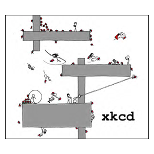
I actually kind of like this. Apparently it's the back of the xkcd book, too. It's a wacky design, it clearly took more effort than all the new shirts put together, and it has a crazy energy about it, a sort of Rube-Golberg-eque quality that fits what xkcd once was. So I will stop this crazy long review of new products on that high note.
god that was too much writing.
Friday, October 2, 2009
Comic 644: Lobotomy
Let me start off with a disclaimer of sorts. I have found that over the last few weeks I have kept a constant expression of ambivalence to all the new xkcd comics. I believe this is a result of two different factors at play at once. On one end, after being on xkcdsucks for so long, I believe I’m so ready to see the bad in xkcd that it prevents me from laughing at jokes I might have otherwise found funny. On the other end, whenever I question how bad a comic is, I ask myself “is it really that bad, compared to the verminous, soul-tainting badness of 631?” and the answer is always going to be a resounding “No”.
That in mind, here is my review.
The Art
Since this is xkcd, it is impossible apparently to say the artwork is bad, because as the cuddlefish have yelled oh so many times, “the art is just XKCD’s style!” So I am going to judge art on two different questions: 1. Does the art enable the audience to figure out the setting of the joke? and 2. Does the art add any more humor to the joke?
1. Yes. You can clearly see that the first person is a surgeon and the second person is patient, it isn’t like some of the earlier xkcds where an anchor chair could just as easily be a bathtub. I mean, sure the surgeon shouldn’t technically have the mask on while talking to the patient, unless the patient had SARS oozing out of his arm, or something. But we most associate the mask with a surgeon, so it is an acceptable break from reality.
2. No, the art does not add any humor to the comic at all. This whole thing could have been written in IRC conversation form and no humor would be lost.
The Joke
As I said in the top, I would have trouble laughing at new xkcd comics even if they were of top quality. But this one feels more like a paid ‘comedic’ endorsement of Linux than a joke. I may be the only one here, but this comic has the structure of a ‘comedic’ commercial, you start with a silly, outrageous situation then you plug whatever feature could cause that outrageous situation to occur, then you name the product. Here you have ‘controlling USB ports with your mind’ -> ‘there will have a patch for everything eventually’ -> LINUX. In a good joke comic, everything is supposed to build up to a punch line, but here the only thing that is funny is the beginning of the comic, and everything leads up to the message “Linux is great” which is kinda annoying and not really funny at all. [Carl again: I think this is a good point and I am going to rephrase it: The humor of the situation comes from the idea, tired as it is, of making humans like machines. That is a vaguely unusual concept. But it's introduced in the first panel - the last panel, the joke, is just a run of the mill Linux joke. It feels like a letdown. Sorry for interupting, Kirk.]
Randall has already had a few comics that are more a plug of a product than a comic, but he usually goes at it from the other direction: Product -> Feature of that product -> wacky thing that occurs because of the feature. Here are a few examples:
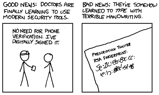
Smarter health care -> Digital prescriptions -> Bad handwriting becomes bad font
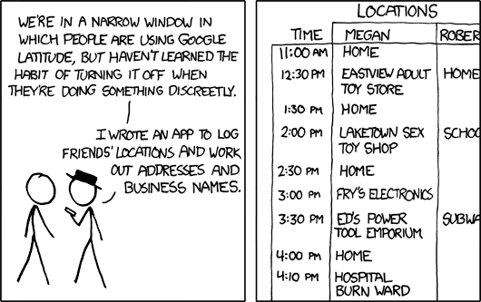
Google Latitude-> Show locations ->Megan is one kinky girl
Kindle -> Lets you check Wikipedia everywhere -> secretly Hitchhiker’s guide to the galaxy
So yes, this isn’t the first time where xkcd is used to plug things Randall likes, but I feel like the change in order weakens the current comic, because in the three examples I’ve linked, if the joke is strong enough on its own, the comic can still be funny. Of course, the punch lines of the three comics I posted range from terrible to alright, so the comics aren’t great, but the potential is there. But as I’ve said before, the current one’s order makes the message of ‘Linux is great’ come across as the true theme.
Oh and I guess I could talk about how the dialog in the last panel is fucked up nine ways to Tuesday, and we have another Humans as Robots comic. But you know, you get enough of that on the blog normally, and I am not guest posting to say exactly what Carl would.
The Alt text
Ok, the alt text made me laugh. I’ll admit it, I like the alt text here a bunch. The suturing of a vista sticker reminds me a bunch of early black hat, and was unexpected after the ‘Linux is great’ theme of the comic. And a lot of humor is derived from the unexpected. I only wish he took the same wacky situation and looked at from the surgeon’s perspective throughout. Then the comic would be making fun of people who take Linux too seriously, which I would have enjoyed heartily.
Kirk out.
The Reddit Interview
Randall Munroe answered the top questions from this reddit thread in an interview recently promoting his book. The videos of his answers are here, and though most of the questions are pretty lame (and mine, alas, did not make the cut), there are a few ok ones and a little bit of enlightening things in his answers. Watch the answers, and read along with my own commentary below!
1. Does he have any comics he regrets?
It's interesting that he only regrets comics that he thinks people don't understand - a sort of "I'm sorry that what I did made you angry" non-apology. Also, I really like the -GRY comic and I thought it was well-put in a way that new comics aren't, so it's interesting that that is the example he focuses on.
2. Will you get over Megan?
INTERESTING. so he tries to make it sound like "oh, it's just a name" but listen to what he says: He says, basically, that he doesn't like to admit that comics are based on his life because then the people in his life get weirded out by the sort of internet-spotlight of having their life be in his comic. But he doesn't say it doesn't happen! Just that he doesn't like to admit it. And that comics are two years behind his life. So - not a very strong denial of the whole theory that the generic stick figure in xkcd really is Randall.
3. What won't you draw?
He wants to make more jokes about gender! Oh god, please randall do not make more of those. He is too angry about how women are treated online! Such a white knight. Oh hey, an explanation of 631. So...it was indeed based on seeing a common pattern in wikipedia anatomy pictures. That is its own kind of weird. At least he admits that he made a mistake in writing it. But it upsets him that people didn't get the joke! MAYBE IT SHOULDN'T HAVE BEEN A SHITTY JOKE?
4. Why has 'romance' degenerated into 'sex'?
I'd love to hear this answer. It's a pretty big problem. He doesn't have an answer. "What I'm drawing about it what I'm thinking or obsessing about." So...it's because he is now obsessed with sex? OK. well. would have liked a real answer there, oh well.
5. What internet thing are you most proud of inspiring?
STUPID QUESTION. no answer could make him look stupider than that question's author.
6. What is it like telling people you are famous?
He doesn't tell them. And now he is getting into his thing about not reading critique, positive or negative. Randall really is likable guy. I do give him that. Why does he have so much trouble translating that into a comic?
7. The ball pit question, how do you keep your balls clean?
The interviewer seems like a way funnier guy than Randall. He should try making a comic. Hm, he is taking the question seriously, and giving his actual ball-pit policy. I...I think he missed something there? I think the question is a joke about testicles? We don't care what drinks are allowed and what drinks are not. You...you don't have to really tell us this.
8. Most surprising person who is a fan of xkcd.
Also a stupid terrible question that I hate. i do not care what the answer is.
OK that's a lie, apparently maddox e-mailed him? And liked the comic? Well i guess I have to be the maddox of xkcd if maddox isn't going to do it himself.
9. Do you know that you have a need to tell people you are getting laid?
Says he addressed it before, that's clearly not true. So he says he writes the comic that seems funniest to him at the time. But still, why is it always sex? OK, there's his answer, sex is funny. I can't disagree with that, I guess. Still - he doesn't de-creepify anything with his answer.
10 and 11 seem not to be working for now. Alas. Perhaps later I will watch them.

