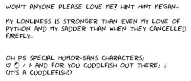
It was made with characters from the comics, and since xkcd is all caps, the font is all caps and lower case letters just type in a different version of the upper-case letter, so it looks a little more varied and a little more like handwriting. Here's a demo of it:
 SO. COOL. This will make our re-done versions of xkcds so much better.
 Download it from his site at http://antiyawn.com/uploads/Humor-Sans.ttf Install it like you would any ttf font, so if you need help look online for your how to install fonts on your particular operating system.
Details: ch00f recommends using it at sizes around 12-14 pts. It doesn't work if you make it too big, and also, if possible, add the slightest amount of blur (the example above was in GIMP at 14pt with a gaussian blur of 0.5). The special characters at the end are ¢, €, ±, ¬, and £, respectively.
Lastly: making this font took a bit of effort and a certain amount of actual money on ch00f's part. He invites you all to use the font and spread it all around for free, but if you are feeling like you would like to show him your appreciation, his paypal account is ch0000f at gmail dot com. (yes, the extra 0s are there on purpose, apparently).
alright guys: the bar has been raised significantly. Figure out what you all are doing to make this community more freaking awesome.
Holy crap! It is amazing!
ReplyDeleteOkay I need to figure out how to install the font! Wheee it's like Christmas.
Suggestion: Do you think Cuddlefishes would like this? I mean we can link to it in the forums...
A random conversation after I showed my friend this font!
ReplyDeleteYou are a good person and people say nice things about you (sometimes)
ReplyDeleteAmanda you forgot to block out you convo pardner's moniker on one line D:
ReplyDeleteIt would appear that you found nothing wrong with the recent comic, you're going soft.
ReplyDeleteASCII only?
ReplyDeleteToo bad. That makes it unusable outside the US.
ch00f, you are a goddamn winner.
ReplyDeleteOh damn! Okay hopefully it is fixed now! But photobucket has a tendency to suck >=( Thanks, Linty!
ReplyDeleteat the risk of making the joke painfully obvious, I like "xkcd-sans(humor)" as a font name.
ReplyDeleteThat's ok, but "humor-sans" more closely parallels "comic-sans" so I like it more.
ReplyDeletedammit ariel, i was about to make a sans humor joke
ReplyDeleteSo the name refers to the fact that it is a sans-serif font inspired by a humorous comic, right? I know you'd come around.
ReplyDeleteThe D looks weird
ReplyDeleteblame Randy, they all came from his comics.
ReplyDeleteEarlier anon: Yes.
Ch00f, I just noticed that when I use this font on AIM, the word "kill" is especially bold.
ReplyDeleteI am not sure if this was intentional but it made me laugh.
They're changing sex at Buckingham Palace
ReplyDeleteChristopher Robin is now called Alice
Ha, the url for this page says "xkcdsucks is proud to present humor", which is kind of hilarious. Was that on purpose?
ReplyDeletebest. font. ever.
ReplyDeleteI like it, and I like xkcd too. fukken saved.
ReplyDelete"Give me the ...cuttlefish?"
ReplyDeleteSomeone's a Venture Bros. fan.
Yay, now I get to make my own versions of the comics that have yet to be translated into German.
ReplyDeleteBTW xkcd owns. You guys = epic fail.
I think you mean "epic fail that nonetheless provided me with a service I am clearly very grateful to have"
ReplyDeleteI think he means he is an idiot.
ReplyDelete"I saw someone else geeky doing this so I'm going to do it too!"
ReplyDeleteDo any of your dumbasses really still think that spam robots don't know that "firstname (dot) lastname (at) gmail (dot) com" or any of it's unimaginative variations = "firstname.lastname@gmail.com" ? Or you could at least try to use things other than characters that are not allowed in email addresses to disguise them with. How freaking easy do you think it is to search for "(at)" or "dot com" and then ignore spaces and illegal characters and turn the rest into an email address when spaces and parenthesis are both forbidden characters in email addresses? It's like you were trying to make it easy on the robot coders by making it impossible to confuse "[at]" for anything other than "@" or "gmail dot com" for anything other than "gmail.com". Seriously? Robots can translate that into a real email address in a few ms. It's only a PITA for REAL users, like me. Stop doing it. Learn2use spam filter or something.
Very cool font. One minor issue: The comma looks like a full stop.
ReplyDeleteI think you meant that you're an idiot. xkcd sucks is overrated. Which is definitely saying a lot, since somehow, I don't think it's "rated" very highly by anyone, in any context.
ReplyDeleteThanks for the font though. I can't imagine how one would spend money making it, unless you're mentally retarded...
rated pretty highly by these folks
ReplyDeleteYou don't know how incredibly amazing you are for sharing this font! I'm so happy that it exists! Thank you!!
ReplyDeleteI am glad. You should give ch00f some money! I sure never did.
ReplyDeleteHow do I create cuttlefish?
ReplyDeleteYou spelled "loneliness" incorrectly. I didn't read through the comments to see if anybody else pointed this out, so I apologize if I'm being redundant.
ReplyDelete