I think it's safe to say that
MSPaintAdventures has hurled itself to the top of the webcomic world faster than just about any other comic. 2 years ago Andrew Hussie had little more content than two frenetic, abandoned stories called "Bard Quest" and "Jailbreak." Taking their narrative developments from reader suggestions, the stories had little cohesion and were not that much fun to read.
But then he started writing a third story, Problem Sleuth, and he used a little more discretion in deciding which suggestions he would use to advance the plot. The story exploded into a year-long epic and MSPA has been going strong ever since. The plot follows a detective, Problem Sleuth (really his title but functionally his name) and his two compatriots, Ace Dick and Pickle Inspector, as they attempt to leave their office building. Jumping in and out of "reality," acquiring new weapons and skills, duplicating themselves, dying, going back and forward in time, and dealing with all sorts of Weird Puzzle Shit, the story is complex, to say the least. It takes the form of a text-based adventure game, with a command for a character at the bottom of each panel. Online, the reader clicks the command and the next page shows the consequence of that action, with a new command underneath that. Repeat 1700 times.
There are, of course, two ways to read the story online: In real time, a panel or two a day, stretched over a year, or all at once. The two are quite different, as I am realizing - I personally jumped on the MSPA bandwagon after PS was over, and I've been reading the current story, Homestuck, more or less in real time for the last year. PS, though, I went back and read all at once.
The main difference, I think, is that these stories are full of incredible detail. If you are reading a particularly long scene, for example, it may stretch over several weeks (remember that the final boss fight of PS is the entire second half of the story). If reading the story is something that you do a few minutes a day for months, you are liable to forget some of the details as large chunks of the rest of your life happen in between installments. Reading all at once, with only a few breaks, that's less likely to happen. Hundreds of panels ago may only be an hour or so back.
About a year ago, I spent a while looking around online for some site that had all of Problem Sleuth in one long, long page. I wanted to be able to load it all up and then read it over a long train ride, not knowing what else to do with that time. It occurred to me then - before I had read it - that a book might be the perfect format for this story. All the panels are about the same size, and you could just put a panel on each page. Yes, it would be a 1,700 page book, but it could be done. No? But then I started
reading the thing, and I realized that putting it to the page would be a formidable task, not just for length reasons.
But PS's popularity remained strong enough that people decided a book would be a good idea, though not all in one installment as I had amusingly imagined. Volume I, "Compensation: Adequate" takes its name from the first chapter of the story and includes chapters 1-5 (there are a total of
22 chapters in the story). That gives you the introduction, where we get to know the world and the mechanics (as well as the main characters) and a few early boss fights. The book ends just as PS and AD reach some surly mobsters, just before the whole story does a high dive into the pool of crazy.
So how does the story work after it makes the jump from screen to page? For the most part, quite well. I'll talk about the positives first, since there are more of them. As I wrote above, this is a story that benefits from reading all at once. Say what you will about ebooks and reading online, I think most people will have a more pleasant time reading a long story on a printed page, all other factors aside. It's also
faster to read this way, since you never have to scroll around for the next command to move ahead and wait for it to load. No internet connection is as fast as just looking a few inches over. In short, it feels less like a text-based game, the genre it is emulating, and more like a graphic novel. I think it does the story more justice this way and makes for a better read.
One thing I had just assumed they would do is print all the panels equally sized - as they are online. But I was wrong, luckily. As I said above, most pages have four panels, and that's good: the pace is kept brisk that way, since most of the panels are just barely advancing the plot. The panels that are important - the ones that deserve more emphasis in the rhythm of the storytelling - they get a full page. Like
this one, or
this one. Occasionally a large block of text means that a page only gets two or three panels, but it is always done intelligently. Like any good breaking up of rhythmic elements, the fact that you don't notice it means that it's been done well.
Unlike online, the chapters are noted in the text, with each one getting its own title page. I like this, and not only because the title pages have cool drawings that are a sort of more advanced take on an image from that section. Dividing them up explicitly gives the book a better sense of structure. You can feel closure at certain points, and know at others that a climactic moment is coming up.
Lastly, the book is printed nicely. The colors look good, the commands are in gray so they still feel different, and the panels are legible while still retaining the faux-MS Paint charm that the original had. In addition to the main text, there are a few pages extra Obnoxious Notes (a la
this) in the back, and Ryan North wrote as fawning and toady a forward as we were all expecting (not a bad thing) (except, I usually love everything Ryan North does and quite frankly I didn't like this as much. I wonder if he really does love MSPA
too much to write a good forward? think about this later).
Most pages (maybe 3/4) also have short notes by Andrew Hussie at the bottom about those panels. These I didn't like as much. Most felt unnecessary and pointless; the vast majority just make fun of the logical or artistic flaws in the story. Quite frankly, most of them felt forced into the book to give it some extra content. There are some interesting ones - a lot - that give insight into the story and the process of creating it, and I wish Hussie could have added more of these.
As an aside, a lot of the expository author's notes remind me of those from the
Achewood book, in that they are the author, speaking seriously about the work we're reading. They are sort of the textual equivalent of a director's commentary on a DVD. They are interesting, but I can't help but think that there's something lost when the reading of a work is constantly being interrupted by the author telling you about it. You never get to experience the work, alone. On a DVD, of course, you just turn the commentary off, but you can't do that with a book, and skipping the comments altogether seems like a shame. Something to think about.
ALRIGHT, this review has gone on long enough already. Let's get to the serious problems and we can all go home.
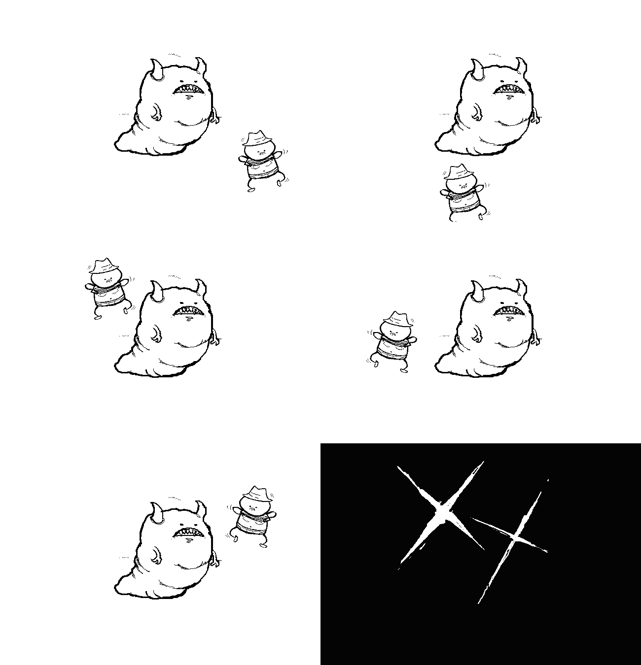
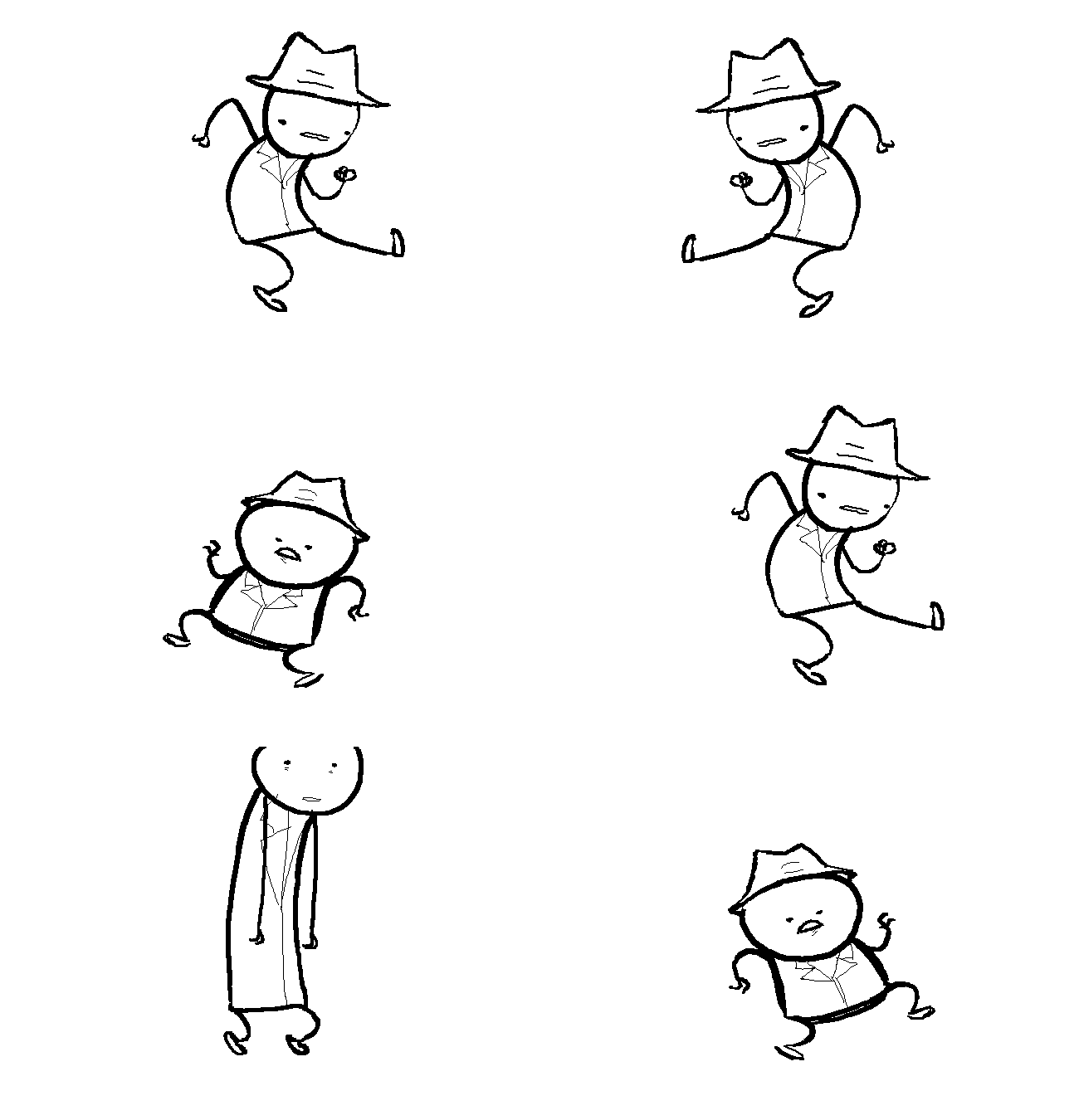
As expected, a major loss in the book is the lack of animations. This is, of course, inevitable, but there are certain ways to get around it. The way Hussie chose was to either ignore the animation in some cases (where it was minor and not particularly interesting) but in the important ones, he splits up the frames and shows you all of them. So here's a comparison of one panel online and its print equivalent.
And how it looks in the book (with a little lens flare from my camera in the lower right corner):

Another one:
And how we see it now:

The fact that the notes below these sections always apologize profusely for the stacity of the image (i made that word up but it's good so whatever) only makes it more irritating to think that you are missing something. Luckily for now, the animations aren't too critical in chapters 1-5. But who knows what
later chapters will need? I assume Hussie &co understand what they have to do and have a good plan.
One might wonder what the author could reasonably be expected to do, short of not produce a book at all. I think the best thing, though it would have been much more work, would have been to rework the story slightly and not hew so strongly to the original animations. Change the dancing, for example, to a new panel showing the same thing. If the art is created to be still, you can add details you wouldn't need if it was made to be animated. It would have made the story a little different from the one online, yes, and some purists (I assume there
are MSPA purists) would have been annoyed. But the reader would benefit.
Other small notes: I was surprised that there were no page numbers. I was hoping for panel numbers, so that one can more easily cross reference the book with the online edition. Short of that though, I figured the pages would at least be numbered so you can remember where you left off (given that so many images are so similar). Not happening though. Also there are some typos and other small mistakes, that is unfortunate. I am sure the second edition can take care of these.
My final recommendation would have been to make one of the front pages a map of the Problem Sleuth world, like many fantasy books have. It could have been a nice place for some new art (not that there isn't plenty of new art spread throughout) but more importantly, it could have made a complex story far easier to follow.
(
update: People point out that there is a
map, thought it's not part of the story, but a more polished version of that is very close to what I meant)
IN SUMMARY,
"Problem Sleuth Volume I: Compensation, Adequate" is fun for the same reasons the online version of Problem Sleuth is fun. The story is good and told with humor, and the art adds to the strange tone of the whole thing. It's an easier story to follow on paper too, though some animated details are lost. There are those people who will love MSPA no matter what, and I don't think they will be disappointed by this. But the people who will be best served by this are those who tried to read the story online and didn't have the stamina for it. It goes faster and makes more sense in print. If you've been trying to get into MSPA, this is the easiest way to start. I look forward to seeing how the rest of the story works in book form.

