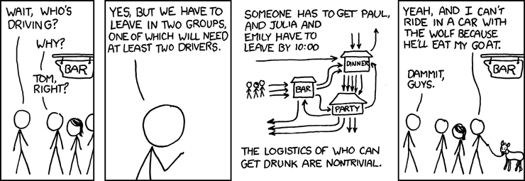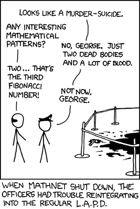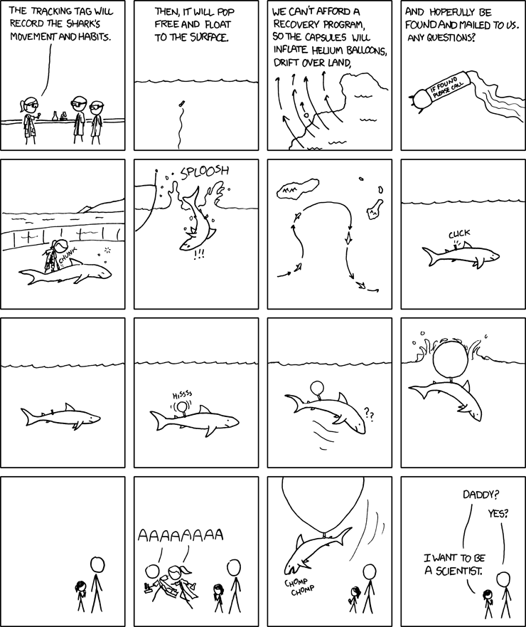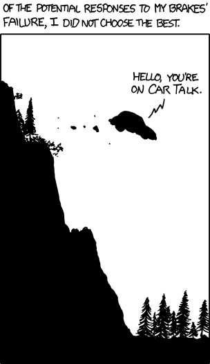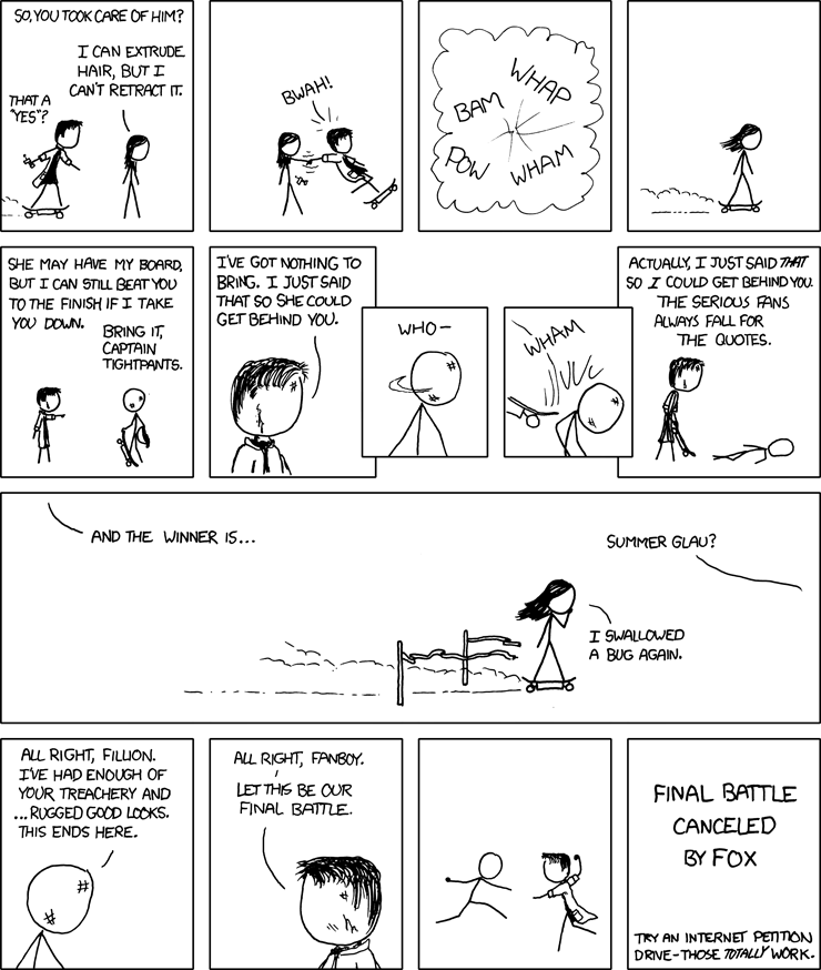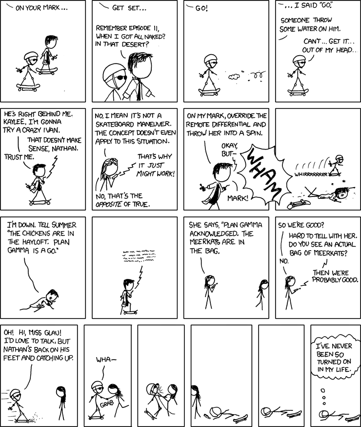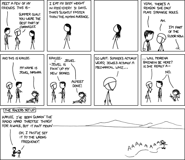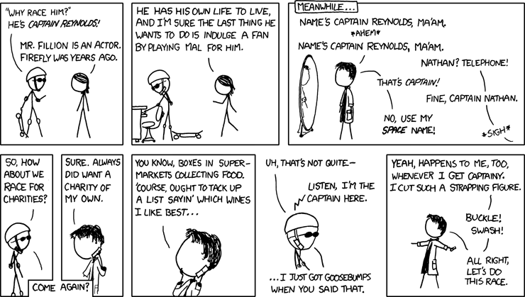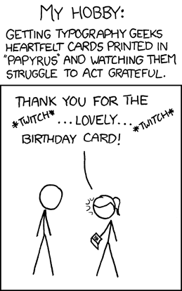
Now I was not aware that "Papyrus" was the worst font ever, just as I was not aware that it was the font used for Randall's favorite movie, Serenity. I learn so much from xkcd. So I asked one of my thousdands of good friends about it. For purposes of this conversation, my friend's name is Jimmy O'Helvetica:
Jimmy: I mean, again -- he's just pandering to the typophiles out there
Jimmy: or rather -- making mortal enemies
Me: is papyrus that bad?
Jimmy: It's not as bad as his handwriting
Me: zing
Me: that quote goes on the blog
But tired old pandering about fonts is not what pisses me off most about this comic, because I do not care about fonts. I care about comics being fucking original.
SO take a look at this chainsawsuit from the day before this xkcd came out.

Now I'm sure this is all just a crazy huge coincidence, and that's why it's an even crazier coincidence that just three weeks ago, PvP also made a "typography geek" comic, though they used the totally different phrase, "font snob." Let's take a look - tell me if you notice anything interesting.
If you answered, "why, Randall made fun of the very same font this guy did!" then woo hoo for you! If you said "oh big deal, papyrus is a lousy font, everyone makes fun of it" than woo hoo! you have helped show that Randall is a tired old hack whose jokes are old and stale and boring! YOU WIN ALSO.
I know, I know, I should give him points for not just making fun of Comic Sans, but really, why? If Papyrus is just as bad, and just as many people make jokes about it, what's the point? Can't you replace the word "Papyrus" with the words "Comic Sans" and get the exact same thing?
Lastly, the comic seemed a lot like 280 to me.
OH ALSO remember: the best font out there, regardless of what Jimmy O'Helvetica says, is still Humor Sans.

