Tuesday, August 31, 2010

Comic 786: Lost In Space

let me tell you what i know about SCIENCE
[alt: I'm just worried that we'll all leave and you won't get to come along!]

I am very tempted to go the xkcdexplained route here and just write the following analysis and nothing else:

"Mr. Beret is excited because of science. His enthusiasm is lost on a sleepy man."

Alas, my nature compels me to elaborate.

I guess the fun in this comic is supposed to come from his child-like enthusiasm - a common enough theme in xkcd. Often it seems to be set up in way which, like in the comic above, the message is that those who do not have childlike glee are missing out on something and the childlike person is happier and better than the other. They nearly all feel like ripoffs of Calvin and Hobbes, which perhaps was able to get away with this by having its childlike excitement come from an actual child.

I suppose another feature of this comic that is meant to be positive is that he is excited about science in the abstract, and not in any way that will affect him (note the "in a few generations" line). Are we supposed to feel the same way? I hope not. Future scientific discoveries are not always those which people expected several generations earlier, and some things, like travel to another planet with intelligent life, seems too remote to even consider getting excited about.

We are left to conclude that Mr. Beret is a figure to be laughed at for his naiveté. I guess that is starting to be a somewhat defining characteristic for him (finally!) - he is dumb and/or enthusiastic. I am guessing we'll have a few more of these comics which will get very boring very suddenly. Dumb people can be lots of fun but the "I am excited about silly things" trope is rather narrow.

Lastly, the ending to this comic is atrocious, with a print-comicesque line from the sleeping guy and a nonsensical response from Mr. Beret. All of it constitutes post-punchline dialog.

Monday, August 30, 2010

Book Review: "Overcompensating: A Dangerous Obsession" by Jeffrey Rowland

Overcompensating: A Dangerous Obsession

I'm a big fan of Jeffrey Rowland's surreal diary comic Overcompensating. It took me a while to read through the archives when I first started, but I thought it was worth it, especially since I think it's gotten better as it goes along. Like Achewood, I think Overcompensating has a wonderful way of using language - even if most of the time it's Weedmaster P calling someone a dick ass in a new and fun way. Rowland is able to write dialect in a way that still feels authentic - that's really difficult to do. But when you read the characters in Overcompensating, they sound like real people.

I also like the fact that his characters will be wearing shirts that change text randomly or they will all be wearing costumes, and no one will comment on this.

None of that is particularly relevant here, I just want to establish that I like Overcompensating a lot, and have high hopes for Mr. Rowland's future both with his comic and with the TopatoCo empire he has forged with his own robot arms.

Point being, when I heard he was making an Overcompensating book, I was very excited. Then I thought to myself, "why did this take so long? he has about 6 years of archives - he could have released a book years ago." Then I went back to being excited.

Thanks to David Malki, I got myself a copy of the book (THANKS DAVID MALKI!) and then proceeded to wait several weeks before writing a review, because I was lazy. But also because I realized the review was going to be very long. For example, we are several paragraphs in and I have still told you nothing about the Overcompensating Book except that it is a book.

Here's the deal with the book: I was disappointed. Some of this was the fact that this book, being Volume I, was full of the early comics - from the first (a classic example of forcing a bad punchline on a not-as-bad comic) to the one where Jeffrey moves from Oklahoma to Massachusetts. The fact is, they aren't great comics - yet. The later comics are better. It roughly corresponds to the quality of the art - which has a flat, far more cartoonish look to it at the beginning. It's also true that putting the comic into black and white takes away some of the energy and fun of the full color comics. I recognize that color printing would seriously increase the cost of the book, but it's also true that it would increase the quality of the final work. Would it be worth it? I don't know - I don't know what the costs would be.

But my real problem is this: The comics themselves are overrun with extra text. Here - I'll show you the image they have on the product description page:


See what I mean? Each comic (or almost all, at least) has a huge amount of text next to it, and I'd say a reader would have to spend about three or four times as much time on the text as on the comic itself.

Now, I realize that this is the exact opposite of the criticism I had for Kate Beaton's Never Learn Anything From History. In that case, I wrote that I was disappointed by how little she wrote about her comics. Nonetheless, I feel like I'm justified here - the problem with A Dangerous Obsession isn't so much the amount of text - though really, it's pretty crazy - it's that it's not all that interesting or relevant. It's mostly just random conspiracy theories of the sort that are occasionally funny in very small doses but are present here by the dozen. The stories just get boring after a while, and distract from the comic - especially when they are physically breaking up the comic itself, as in the left-most example in the image above. At some point I just wanted Rowland to leave his comics alone and let me read them, and not interrupt to tell me about the original version of Ghostbusters and how it was a documentary that made viewers go mad. I think a good example of the right balance to strike - both in tone and quantity - was the way Chris Onstad did it in the Achewood book.

All that said, the quality of Overcompensating: A Dangerous Obsession is made to look far better when compared with the atrocious introduction by one "Andrew W. K." The introduction actually goes for the middle school trick of "I don't know what to write about so I am going to write this introduction about writing this introduction." Mr. W. K. comes off as a huge tool here and in his other portrayals in the comic, and I hope to never have to deal with him again.

Also, just a caveat emptor sort of thing here: there is a picture of Rowland's horrible spider bite necrosis, and it is towards the beginning, and it is not as bad in black and white.

Final grade: C+. It pains me to write it, and I still love the comic - but for now, I'd say to stick with the online version. forgive me jeffrey.

Overcompensating: A Dangerous Obsession is 192 pages, softcover, black and white, and includes the story "Crisis on Infinite Butter Dimensions." It costs $14.

Saturday, August 28, 2010

Comic 785: Sit Down


[Alt: Ever notice how the more successful observational comics become, the more their jokes focus on flying and hotels?]


Ugh. What a sad little comic on which to end my week of guest posting. Here we have what open mic night would be like in the wacky world of xkcd. Each panel serves as its own little mini-joke, and the alt-text is an observational joke about observational comics. Hee hee! How meta!

None of these jokes are particularly amusing. The first panel is essentially "lol, aphasics can't speak correctly." As much as I love making fun of people with disabilities, just pointing out that they're incapable of doing something isn't enough to make a joke for me. YMMV.

The second panel is the evil Mr. Hat. He launches into a joke that one expects to be a typical "yo momma so fat" snap, but ends up being what I assume is supposed to be a biting insult about how yo momma wishes she never had you. Oh, how you cut to the core of me, Mr. Hat. I liked you a lot better when you were cutting improperly parked cars in half. At least then you were moderately clever.

The third panel is... OMG OMG OMG A COMPUTER SCIENCE REFERENCE *nerdgasm* Okay, now I need to go smoke a cigarette. Well, except that it's not exactly an accurate reference to a quine, but that's only something a super pedantic Aspie would say, right? B- for effort, I guess.

The last panel is Mr. Beret saying something idiotic that I guess is supposed to be something wacky and out-there. Oh, Mr. Beret, I liked you a lot better when you were giving woodpeckers power drills. At least then you were somewhat cute.

Hey, ever notice how the more successful nerd comics get, the more their jokes reference a shoehorned compsci concept?

Anyway, thanks for tolerating my presence this week. I wish I could have finished on a much higher note, but this comic was seriously the textbook definition of "meh."

Lots of love,
aloria.

Wednesday, August 25, 2010

Comic 784: Just Take a Dirt Nap


[Alt: Sweet unintersecting dreams!]

It appears that poor Randall is having some trouble with his love life. Either he has been participating in some unhappy relationships, or, like me, has been out of the love game so long that he has become bitter and disenchanted with the concept of romance. Contrast recent strips like 770 and today’s with the sappy shit he used to produce. For example, take this strip , which is so glurgy and saccharine that I just vomited a rainbow.

Given my (and many of you guys’) distaste for xkcd’s usual tack of “look how quirky and sweet our relationship is, aren’t we just the cutest couple on earth” crap, you’d think this sort of thing would be a welcome change. It isn’t. The whole “look how bitter and jaded I am” thing is just as bad as the quirky love thing; they’re just flip sides of a coin forged of pretension. So you’re sleeping with a girl you can’t stand, so much so that you huddle on the edge of the bed? Tough cookies. Kick her to the curb, or quit your bitching.

Aside from the whiny little bitch vibe this comic gives off, it fails on a few other levels. Part of xkcd’s draw has always been relatability; as much as we mock the whole “GOOMH” thing, fans seeing a bit of themselves or their lives in a strip contributes highly to its appeal. Even ignoring the “nerds don’t get laid” stereotype, do you really see a lot of fans going “GOOMH, I shared a bed with someone I hate, too!” Even if it’s a common occurrence, which I doubt, people generally don’t like thinking about uncomfortable situations. It’s an awkward reminder, especially when coming from xkcd, which tends to be pretty light and whimsical. It’s like reading Blondie and being reminded of the time your drunk uncle exposed himself at the family reunion.

The second issue is that it isn’t immediately apparent what is going on here. Of course, initially thinking they’re in love and then realizing they’re not was Randall’s intent, but until you really scrutinize the last panel, it doesn’t hit you right away. Slowly figuring out the punchline is fine when the eventual realization is really mindblowing. Here, the payoff is just some weepy emo shit, so the fact that it doesn’t “pop” makes for a really lackluster conclusion.

Third, as many have pointed out, this is totally an A Softer World rip-off.

Tuesday, August 24, 2010

Guest Review: "Questionable Content"

many months ago, Ann Apolis decide to wade into dangerous waters by reading the archives of Questionable Content by Jeph Jacques. The content proved so questionable that she had to divide her review into multiple parts. Here is part one. I have never read QC so I absolve myself of all responsibility for the accuracy of this post. Enjoy --Carl


Hello, compatriots! My name is Ann Apolis, medical doctor and doctor of humour, able to observe comedy with the detached air that comes of living in Actual England instead of New England.

It so happens that one day on the #xkcd-sucks IRC channel Kirk suggested (nay, demanded) that I read the webcomic Questionable Content. And I did. And, mindful of the common criticism of this blog ("Why do you spend all your time whining about xkcd when there are worse things in the world, like genocide and war and Questionable Content?") I decided to write up my experience for Carl 'Ugly' Wheeler to display on his popular pictoblag.

So.

---

Here is a song. It's "Lady in Red" by Chris de Burgh. Go listen to it.

Did you like it? Of course you didn't, it's "Lady in Red" by Chris de Burgh: reheated cabbage with a dodgy backing track that would elicit sneers at the Eurovision Song Contest. I hate it. And yet... and yet I rather enjoy listening to it, because its utter detestability fails to outweigh how pleasurable it is detest it, what joy there is in mocking every facet of its carefully constructed awfulness.

And it was much the same emotion that got me through reading the first 507 strips of Questionable Content. There is a lot to mock.

I shall go easy on the art; it is only the first 507 strips after all (looking at the latest ones it seems to improve a lot) and given that it's a webcomic on the internet nitpicking the art seems petty; suffice to say, the canonically fat Faye doesn't look particularly fat and the canonically well-endowed Faye doesn't really look bigger than the other two ["Ann Apolis, why are you staring at boobs on the Internet?" "It's research for an article!"]. But as I said, picking on the art is a little unfair.

Picking on the writing isn't. Again I imagine it probably improves (or at the very least changes) over time, but the writing in these strips is pretty bad. For one thing, Faye (who is over this period of time pretty much The Main Character - Marten exists to facilitate plot and conversations with Faye) is kind of a jerk. She punches people a lot and is generally rather nasty. (Aside: I can't find it cos there's no search function, but there's also that comic where she punches the dude in the music shop for being judgmental about other people's taste in music. Despite the fact that QC seems to be The Official Webcomic Of Being Judgmental About Other People's Taste In Music: uno, dos, tres...) And I don't like media where the main character is a jerk because I don't like hanging around with jerks, even if they're meant to be jerks (and Faye is meant to be a jerk, and Jeff has crafted her very well as a jerk).

Thankfully (SPOILERZ) she does get called on it, although (EVEN MORE SPOILERZ) she gets given a Freudian Excuse for it later on, and I can't really tell whether her character changed in the long-term, because I'VE ONLY READ UP TO STRIP 507 jesus people.

Characters are all yer generic wisecracker, pretty interchangeable as long as you're careful. One particularly annoying tic with the writing is the attempt to make every joke a Brilliant Social Observation, and the result is that the girls all say things like "Remember that all girls like going to the park!" and the boys say "Ah but as a boy I want to get into your pants" and then someone will say "Indie rockers [like us!]; why are we so obsessed with", er, I dunno, "indie rock", and it all devolves into that awful As You Know stuff. And it does happen. All the bleeding time.

What else? Oh yeah, there's that strip (again I can't find it) where Dora the goth comes out of her house wearing a pink shirt and you think "OH WELL THAT'S NOT A METAPHOR FOR HOW SHE'S ABANDONING GOTHHOOD AT ALL" and it's a bit clunky and obvious to be frank (although maybe this is just my superior literary ability ruining things for me).

Wow, some of the guest strips are pretty harsh (I include the last one only because of panel one).

Nice things! Let me say some nice things. Well the art is sure as hell better than some comics I could name (hint: look at the blog name!), and for someone who's admitted to using copy-and-paste sometimes he sure manages to conceal it well. Also Jeff usually tries to make humour flow from the conversation rather than shoehorning a punchline in somewhere. That's commendable. Marten is actually quite a good character, really; he works as Punchline Vehicle #3, as a sort of blank slate character for the action to revolve around, and it's also pretty easy to get a handle on who he is.

Why did I only read up to strip 507? Well (SPOILERZ) it drops a pretty big drama bomb so that seemed like a good time to stop. Also I suspect it changes quite a bit after that strip so it was best if I got my insights on strips 1-507 done before thinking about the rest.

Right, I think that's everything. There we are then, Questionable Content: a webcomic of indie snobbery, jerks, "as you know..."s and bewbs. Do your worst, Internet.

P.S. I am myself an indie snob so don't be all "well maybe you'd appreciate it if you had actually heard of The Arcade Fire".

Comic 783: Lost the Plot

make me a taco
[Alt: Yes, I understand that the turn is half a mile past the big field, but my GPS knows that, too. This would be easier if you weren't about to ask me to repeat it all back to you.]


Hi there. I am Aloria, here to comment on xkcd 783, and I hate you all.

Can someone explain to me what the fuck Randall Munroe’s problem is? We get it dude, you’re super smart and tech-saavy and doomed to live in a world populated by morons who just don’t get technology and science like you do. Maybe if you weren’t such a condescending douche, you could try educating some people instead of constantly portraying them as clueless retards in your pictoblog, erm, webcomic.

This is essentially an artificial, unrealistic scenario for GOOMH fodder. Not true GOOMH, mind you, but that special brand of xkcd-fanboy GOOMH, e.g. “wow, I have a GPS and some of my friends don’t, too! lololol Randy is such a mindreader.” I dislike the implication that not knowing about GPS technology is commonplace; ads for TomToms and the like are everywhere, rental cars often come with them, and I haven’t had a cell phone in the last 3 years that didn’t have it. Additionally, I can think of only a few instances where someone would incessantly babble directions after being repeatedly told they weren’t needed. They all involve people of diminished mental capacity (elderly, socially clueless, etc,) none of which deserve Randall's condescension. These sorts of folks would blather on regardless of the reason given; you could tell them you’re familiar with the area or have a map and they’d still talk. It has nothing to do with GPS ownership status. Take out the GPS aspect, and you basically have a comic bitching about how some people don’t listen, or like to talk a lot, or are overly concerned about you getting lost.

That last point is sort of important, you see, because GPSes aren’t exactly infallible. I have two, actually (I'm the kind of jerk that carries two cell phones,) and they’ve tried to get me to drive into the Hudson River, make an nonexistent left hand turn, and suggested many creative ways of violating traffic law and/or killing people. They can also be vague or confusing, and sometimes the addition of visual landmarks is helpful in situations where you know the GPS will throw someone off. People cognizant of that fact aren’t deserving of mockery, either. This strip reads to me like a weak grab for smug self-superiority (much like this blog post! wheee!)

Monday, August 23, 2010

Placeholder: Comic 782


alt text: It gets worse! You know that wizened old monk with the gypsy wife whose voodoo shop we smash up every day after school?

I thought Carl was going to cover this one. Maybe I am supposed to. Suck a panda's dick.

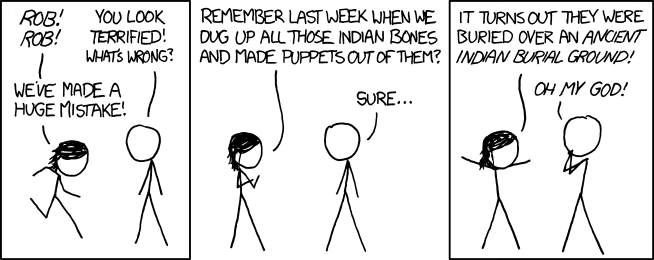
-- Alright, time for some SERIOUS COMMENTARY. What the hell is this shit? I mean, I just drank like all of New Jersey's beer supply, and this still isn't enjoyable. Indian bones from an Indian Burial ground? HAHAHAHHAHAHAHA TOTAL SUBVERTED EXPECTATIONS DAWG. Fuck you, Randall, you owe me like $6 from all the beers I drank to make this shit coherent.

No love,
drunkloria.

Thursday, August 19, 2010

Comic 781: You Have it All Backwards

you got it all wrong
[Alt: They actually started the reversed-text practice in 1973 -- not for ease-of-reading reasons, but because too many people were driving backward down the highway blasting the Star Wars opening theme.]

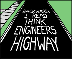
I find this a wholly boring, forgettable comic. Yes, sometimes words are printed on the street/highway such that if you were to look at them in this way, they may seem backwards (not "backward"). But they aren't meant to be read that way; they are meant to be read in the way most useful to drivers, and that means: if you can't see the message easily and all at once, write it in segments so that drivers can read it logically. It's sort of like how if you read a blog from top to bottom, you'd be reading it "backwards" because it's the opposite order of how it was written. Crazy! (this is as good a time as any to point out that Randall recently passed the 3-months-without-a-blog-post milestone, an event which I note with no comment).

The point is, yes, the text is written in an unusual way, but it has a reason, and anyone who thinks about it will understand it. Jabbing at the highway engineers who wrote it in the best way seems pretty obnoxious to me.

Also, though Randall later changed his alt-text to be accurate, it did originally imply that Star Wars was released in 1973, a claim that laughably incorrect to anyone who is actually a nerd. But that's ok! You don't have to be a nerd, you just have to pretend. I have, of course, presented the alt-text as originally written. No acknowledgement of the change was made on the part of xkcd.com.

----------
I, like many people, noticed that Ryan North co-edited a book based off an old comic he wrote. It's a collection of short stories, all written by different people, and as you can see by the list of authors, one story is written by Randall Munroe of xkcd fame and fortune.

I'm not sure what to think about that - one the one hand, most of what we've seen Randall create over the last few years has been pretty terrible. That said, this book got hundreds of submissions and I think highly of Ryan North (and David Malki, who has sent me some free books from TopatoCo, one of which i still need to review, dammit) and I don't think he'd include a sub-par story just because it was written by a well known comic person. Anyway - we'll see how it is, I guess! A cool idea for a book.

Tuesday, August 17, 2010

Comics 779 and 780: So Close, And Yet, So Far

I return! As I had called away mysteriously, I was unable to post about comic 779 on time and rather than skip it or post a full post, I'm going to combine it with the next one, a move that is only slightly precedented on this blog (but which is quite frankly not a bad idea). This is mostly out of necessity, but it also happens that they have some things in common which I think are worth touching on. Specifically, they both are in some ways closely approaching a joke, but each makes a crucial mistake that sets the comic's value back enormously.

Let's take a look!

no not this one
[Alt: Don't need any, thanks. I have a backscattering fetish.]

First, a note about the art - some readers expresses the theory that that four right-most men (not counting Mr. Hat) are all the same character, portrayed walking up to and away from the Viagra stand. Perhaps that is the case - they all look the same and do have the same suitcase. Alas, the art does not make it clear. I'm going to have to assume that they represent different people; that would be fitting with the general comic convention and without any evidence we can't pretend that he did anything else.

SO - on to the comic and its flaw. This is related to the fact that people seemed to be in one of two camps with regard to the joke here: Either the viagra is there because the men going through the scanner are worried about how their dicks will appear (ie, they will appear small, ie, they will appear correctly sized), or the joke is that it is there so that the guard will have to look at their dicks. Either way, it's a dick joke and we know how I feel about those. We also know how Randall Munroe feels about such jokes, or at least did, before he ran out of inspiration and started making the kind of comics that he had formerly railed against.

ANYWAY, the question is, which joke is intended? It's an important distinction because one joke is funny and one joke isn't. It's a question, I think, of power relationships - does the guard have power over the passengers, because he sees them naked and they have basically no choice in the matter? Or do they have the power, because the guard has to stay there and watch naked person after naked person, while the passengers get to fly off to exciting places? It can be taken in lots of different ways.

I think that if you have to make a dick joke - and you never, ever do - the common thing to do would be to play off of the widely spoken of idea that men are worried about the sizes of their dicks. So the idea that a man, thinking that a stranger would briefly be able to see a representation of his dick, would deliberately take prescription medicine to increase its size is, perhaps, a place where a joke might live.

Alas, that's not what the joke actually is. Randall could have made this comic quite easily, but instead, he added the security guard saying "oh god," making the joke "Ha ha, that man will have to look at larger dicks than he would otherwise have to." Which is just...stupid.

Link

i refuse to believe it!
[Alt: There are two or three songs out there with beeps in the chorus that sound exactly like the clock radio alarm I had in high school, and hearing it makes me think my life since junior year has been a dream I'm about to wake up from.]

This comic also has a serious flaw based on a good idea, though unlike the first comic, its flaw is more central and ultimately means that the comic is irredeemable.

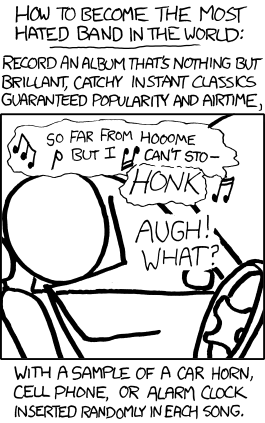
The flaw is this: The joke is based on the idea that you make a very popular song, but you insert noises that make it annoying. If you think about this premise even a little bit, the problem jumps out: If the song is really annoying, it won't be popular. And, similarly, if a song gets really popular, then a lot of people don't find it annoying. It can't possibly be both, because people don't generally intentionally listen to music that they hate, over and over again.

A more realistic, and far better, version of this joke was done in comic #70, though like the original dick comic above, it's possible that that was so long ago that Randall has simply forgotten it ever existed.

Anyway, even if such a song did somehow become popular, after the first time hearing it, people would probably realize that the song has those noises and not be surprised each time they heard it. People aren't stupid like that. Surely people will begin to speak to one another and say: "Album [whatever] would be good, but what is up with the noises?" It's not like you could stealthily sneak the noises into the song, such that people only notice them after the song is popular. Though I do think that would be a fun idea. Alas, it's not what Randall is proposing here.

Also, wouldn't people get suspicious that the honking sound was coming not from outside the car, but from their speakers? One can tell from which direction sound is coming, after all.

Also, Anon pointed out that he spelled "brilliant" wrong, quite clearly missing the second "I." Take a look! To his credit, he did spell "guaranteed" correctly; that can be a tricky one!

------
So, there you have it. Two comics where, like so many, Randall could have used the editorial guidance of a friend or colleague, but didn't. His loss, really.

-----
i hope my next 500 posts are as much fun as my first 500! thank you all for reading. this would be a great time to reread the entire blog from the beginning.

Saturday, August 14, 2010

Weekend Fun Links

WELCOME TO WEEKEND FUN LINKS, EVERYONE, it is where I realized I have TOO MANY LINKS to merely stick them underneath another post. Let us get started!

--Ryan North, as you all no doubt saw, got married last week and is having tons of guest comics while he is off on his honeymoon. The difference between this extended guest week and others is that all the comics are on the theme of love, marriage, and ryan north's marriage. Some are better than others, of course, but I think on the whole it's been a pretty good run - I was a particular fan of Joel Watson's comic and also David Malki's, though I thought his choice of final panel was awfully tricky given how random and forgotten a character Morris was. Do you remember him, dear reader? I do. He is a tiny bug who lives on T-Rex's nose and generally is quiet during the entirety of the comic.

--Proving I can do this from both sides: I yell at xkcd a lot for copying other jokes, so it seems only fair that I point out that I think this recent Toothpaste For Dinner comic is basically the same as xkcd #597. To be fair, Drew has been making a comic every day for the past 6 and a half years, so perhaps something like this is to be slightly expected.

--That said, elsewhere in the Natalie Dee/ Drew world (the Drewniverse, I am going to call it) we have an actual example of getting real life revenge on real life idea-stealers. Nicely done, my friend. Nicely done.

--You all know that I love Moe and I'm glad to see that the comic is still being updated, if irregularly. I'm not totally sure how I feel about the newest, animated comic - I'm usually very wary of animation in comics, though in this case I think the fancy animation contrasts well with the low energy, regret-filled actual content.

--I'm also intrigued by the new way Michael Firman is raising money for his comic. I still feel like Moe should be more popular than it is, and he should be able to make some money selling things, so hopefully this is a good start. GO BUY HIS STUFF, guys. Seriously though I think the art in Moe is really amusing and maybe I will have to send him some money and get one of these done for myself. Maybe.

Those are all the fun links for this weekend! Try not to have any more fun outside of the fun gleaned through these links!

Wednesday, August 11, 2010

Comic 778: Some Kind Of Horrible Mistake

whu wh whaaaaat?

[Alt: 'How about a little ... *family growth*?' 'Dude, that's not until round two.' ]


Let's talk about art. More specifically, let's talk about how comics use certain symbols to represent concepts that are inherently undrawable. For example, speech. The usual convention is that a character's speech is either contained in "bubble" which points to the character speaking it, or, there is a line connecting the person's mouth to their words. None of these bears any particular resemblance to what happens in reality when a person speaks, but it is a necessary convention in order for comics to work at all (or at least, non-silent ones). Moving on.

What happens when two characters need to say the same thing, at once? The usual convention is to have the text written only once but have it connected to both characters. As you can imagine, this can be tricky if, say, the characters are on opposite sides of a crowded room, or if the characters have other lines to say. Now, I firmly believe that a good cartoonist can find a way to make this work, but sometimes it can be tricky.

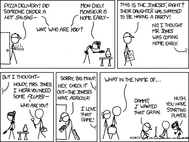
I bring this up because the first panel of today's xkcd offers a helpful example of a massive failure in this sort of problem. He has two characters, who each say one unique line and one shared line. I think a better way to deal with this situation would be to have the lines in separate panels - so that the panel with both of them saying "Wait, who are you?" doesn't have any other text. As it is, there is a continuous path going from the man, through his first line of text, through the shared line of text, into the woman's line, and then into the woman herself. This is very bad. We naturally read left to right of course (at least, when we are reading in english) and so we'd be inclined to read the text in that order - Man's Line, Shared, Woman's. The line tracing that path only makes it more natural to read that way.

But that's not the way it should be read - the shared line has to be last, because the unique lines are both said before the character realizes there's a mistake. Anyway, it ends up making the whole comic get off to a hugely confusing start.

Also, the woman has some kind of spider sponge monster attacking her neck but I assume that is just usual xkcd bad art.

The second panel, I am happy to say, is not as awful as the first. Astute readers will figure out the premise of the comic from here - that characters from different cliched pornographic films are interacting in a situation they are not prepared for. The less astute readers should hopefully understand it by the end of panel 3.

Let's pause and let me point out that, glaring flaws in panel 1 aside, this set up could be amusing. What could have conspired to have these people all in the same room, all expecting certain other people but not the ones who are there? More importantly, will anyone have sex? It must be a complicated plot - after all, all the characters are actors, knowing that they are in some kind of film. Unless the author thinks that people actually behave this way. But I doubt it. In any case, yes the first three panels seem unrealistic - but they also seem like they could be a good way to set up a great punchline.

Alas, the only punchline in this comic is the "line" that my fist traces as it "punches" Randall Munroe in the face. I'm sorry. I do it out of love.

As I tragically learned, none of our questions were answered. Instead, the comic took a jarring turn, having all the characters begin to play a semi-unknown board game. We don't find out why they are where they are. We don't see any consequences. The Jones family, whose house was broken into by these sex workers, can't muster any sort of reaction beyond the first half of a sentence, and that sentence is filled not with anger, but with simple confusion.

Now, most of this comic is not enough to send me into a spittle filled rage. But then there are those pesky little details -

Look. I'm sorry Randall. I know you are a nerd and you are proud of it. I know your audience loves nothing more than realizing that you play the same nerdy games as them ("OH EM GEES, Randall plays Settlers of Catan? I DON'T KNOW ANYONE who plays that game except the people I play it with and most of the Internet!"). But goddammit that does not mean that porn stars all love the same games as you. I don't really care why you made this comic because the ultimate feeling I'm left with is that you wanted to make a comic where extreme sexiness was forever linked with playing your danged resource-based tabletop game and all the characters suddenly start acting like socially mistaken middle schoolers and hey holy fuck! that's what your entire audience is made of!

The problem is that none of this makes sense. In the world, humans tend to make choices and actions based on the present situation as they understand it, past knowledge that they have (firsthand or otherwise) and desired future outcomes. BUT IT DOESN'T MAKE SENSE THAT THREE STRANGERS, TRYING TO HAVE SEX ON CAMERA WITH NON-PRESENT PEOPLE, AND FINDING OTHER SIMILARLY CONFUSED PEOPLE AROUND THEM, WOULD SUDDENLY DECIDE TO START PLAYING YOUR STUPID GAME. that is not what happens. ever.

God, using that game is such horrible fan pandering. Why does it have to be that game? Why can't it - and again, I'm here temporarily conceding that it makes any damn sense for them to play a board game of any kind at this point in their sorry little lives - be a more normal game? One that a variety of confused stranger may actually know the rules to? Because xkcd readers won't feel special that way! xkcd readers want to come to the site to find out that their own little quirks and joys - the things that make them so unique and special in exactly the same way that every other pseudo-nerd is - are shared, appreciated, and most importantly, acknowledged as special. If the game had been scrabble or monopoly or clue or chess or checkers or backgammon or anything reasonable, then hell, anyone could have appreciated that joke! Even NON-NERDS might have laughed at it!

I'll pause to let the xkcd lovers out there have a heart attack or two at that thought.

Luckily, Randall knew to pick the sort of game that would make pretend nerds fall over with glee merely to read the name of. Do you think this does not happen? YOU ARE WRONG, MOTHER FUCKER.

But look - terrible middle school sex fantasies aside, and stupid nerd pandering aside, the biggest problem with this comic is that it simply makes no sense. We don't know why they are in the house. We don't know why they seem not to care. We don't know if they are meant to be actors or merely people acting in real life the way certain actors reportedly act in certain films. I'd be happy to suspend my incredible amounts of disbelief if it were worth it - for example, that's what I did only one comic ago. But that doesn't help! It doesn't make anything make more sense. We're still just left with confused, sexed up strangers playing games like they are at an all boys 8th grade sleepover birthday party but they are in a stranger's house. I just - I guess I just give up. This comic utterly confounds me.

Perhaps the alt-text will redeem it? Or perhaps you are a silly fool who hasn't learned the way this always ends?

Let's talk about the alt-text. I can't quite decide what the joke is - it's either that in the game you can "grow" your family my having the two parents make a child; presumably they do this through having sex (shown off screen). In that case, the alt-text is taking the concept of "having sex" and using it as a euphemism for the act of having sex. OR, it is a joke because in the game your family grows larger, whereas while having or preparing for sex, a man's penis grows larger. What I'm trying to say is that there are complex layers of humor here.
Tuesday, August 10, 2010

Comic 777: Comic Strips

Bore Strips, am i write
[Alt: I'm sure they're a harmful tool of the cosmetics-industrial complex and all, but my goodness do those strips ever work to pull gunk out of your pores. I was shocked, disgusted, and vaguely fascinated by the result.]

I like it. It's very quick - you could easily imagine this joke getting dragged out way to long, but it isn't. It's visual, and the lack of dialog emphasizes the visual aspect of it. There are comics where you need words, and fewer words are a bad thing, but in this case, it helps. Words would only distract.

The image is of course unrealistic but I'm seeing it as a cartoon, not as something real. It's true that the art could be better - perhaps make it a little more obvious in panel 4 that he's actually pulling on the thing, and in panel 5 the head could be more deflated and the skull more clearly a skull.

Yes, the acne theme is tailor made for high schoolers (like everything else on this website nowadays) but I'm willing to overlook it because it's weird enough and I can't think of any other way for the joke to work. Well, I guess he could have been pickin' his nose -
http://www.cyriak.co.uk/gifs/queen.gif

Anyway, the point is, this joke is and should be read fast. A beat or two of anticipation, then a sudden visual punchline, then move on to the next webcomic in your RSS feed. The end.

I realize that some of you want to read genuine anger about this comic, and since I have not produced any, I leave you with the words of mysterious nomad Jake, who angrily wrote to me with the following thoughts about the comic:

===========
There are so many things to say about this complete disgrace of a comic, I'm just gonna get down to it and go frame by frame.

Frame 1: First can I say that is the worst excuse for a box of pore strips ever? Or anything for that matter. What the fuck is that random star in the corner? It must've been drawn by my 11-year-old cousin, what excuse for an adult draws a star like that. But aside from minor details like that, the composition of the frame isn't bad. It's a box. But...it could be better. Maybe we could see the box over the shoulder of the subject, or see him taking the strip out of the box while the box is clearly visible. We could save a whole frame. Take out frame 2 and make it clear he is holding the box in frame 1.

Frame 2: Not much to say here. He's holding the box. Really a pointless frame. Like I said...could have been combined with frame 1 but let's not go over that again. Like I said...not a horribly disgusting issue, so we'll move along.

Frame 3: Can I just take this moment to say that the art of XKCD is horrible? I feel like the joke (well...joke is a...strong word...) would be better executed if you could see facial features. Especially a nose in this case. I get it...stick figures are his thing. But if he can do such artistic backgrounds like he has done in the past...what doth hinder a nose? Or some eyes? Or something! But sticks are his thing...so we'll move on.

Frame 4: This frame is essentially the same as the last one except one arm was lowered. Now I believe this is to indicate he is getting ready to pull on it. But cover up the last frame for a minute. No really, go now. Cover up the last frame with your hand on or near the screen. See
it? Without the last panel it is impossible to tell he's pulling. It just look like he put his arm down. I don't know how he could have made it better, though (besides not doing making a comic at all, amirite?). So I won't scrutinize Randall too hard about it.

Frame 5: *cue what the fuck*. WHAT. THE. FUCK. When I first read this, my first thought was literally "wait what did I miss?" I seriously was dumbfounded. I then realized that he was indicating it's so deep cleaning that it pulls out your skull. Ha. Haha. Wow Randall.
Hi-fucking-larious.

That was sarcasm by the way.

What makes that funny? It's unexpected-ness? (is that even a word?)[yes - Carl] Randall...we have been over this. Random and unexpected does not a joke make. Just because it's unexpected doesn't make it funny. Don't get me wrong, it can. But they are not one and the same.

Fishfuck.

Was that funny? (yes - Carl) I don't think so. Was it unexpected? Probably. A joke shouldn't just be unexpected, but have a layer of reality to it. Something can be unexpected AND realistic. Novel thought, right?

Sidenote: Anyone else notice this is comic 777? Randall didn't do anything special. I mean, I don't want some cheesy "reflection" shit, but give your retard fans SOMETHING.
===============

If you need any evidence that our own commenter R. is a far funnier man than R. Munroe, look no further than his edit of this comic.

Are we going to get a p=/=np comic in the next week?

Sunday, August 8, 2010

Comic 776: Bad Dream

NO SLEEP TILL BRANSON
[Alt: I'm not listening to you. I mean, what does a SQUIRREL know about mental health?]

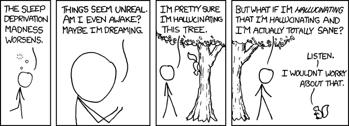
I'm going to have have to side with xkcdexplained on this one, their policy of drawing dicks on people aside: This comic completely reeks of someone who just saw Inception, and has been contemplating its dream-within-a-dream themes. If Inception wasn't totally taking the internet by storm these days I'd have a little less sympathy for that complaint, but I've read the sentence "I heard you like dreams so I put a dream in your dream so you can sleep while you sleep" or some variant so frequently that the notion of hallucinating a hallucination is utterly boring to me.

Of course, there's also the problem of the fact that the logic in the comic doesn't make sense: How is it "sane" to have a hallucination so extreme that it generates its own meta-hallucination? That's not sane at all. What's sane is not hallucinating.

Anyway, then you find out that no, he is not sane, he is hallucinating for some reason and there is a talking squirrel. The joke is: He thinks he might be crazy, but he might not be, and then it turns out he is crazy. Ha!

Perhaps I've mentioned before that bad exposition - in anything - really bothers me. This happens all the time in movies and TV shows, and it generally bugs me when it's so noticeable. So, needless to say, the first panel of this comic is about as bad as you can get on that point. "The sleep deprivation madness worsens," with 3 little bubbles of some kind above his head (the bubbles represent the fact that he is tired, apparently). Generally we might want to know why this fellow is sleep deprived; the reason might even be funny. But we don't get that, we get: He is tired - accept it. I think it's the word "worsens" that is bothering me - it makes me feel like there is a backstory that we don't know. And it's unnecessary! If he had said "God, I haven't slept forever. I'm so tired." Not great, but at least it's not implying that this is Part II to a sleep deprived adventure.

Ah, for the good old days of sleep deprived comics...

=====

The Overcompensating book came in the mail the other day but I haven't had time to review it. Hopefully soon! The book is very strange.

Wednesday, August 4, 2010

Comic 775: Psyche!

Savannah moon
[alt: She's a perfectly nice lady from a beautiful city, and there's no reason to be mean just because she thinks a quarterback is a river in Egypt.]

I know in general I usually post about comics after you all are done talking about them, but in this case, I really couldn't wait. This comic is so weirdly confusing and terrible.

First, to get this out of the way - yes, the art is basically the same as yesterday's. It's not exactly the same - I checked, very meticulously - because as you can see in this comparison, the man is clearly raising his arm in one drawing and is not in the other. Let's look at the two with the dialog removed:

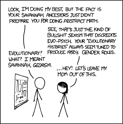
the same!!Anyway. The joke is, the boy says something about the girl's math skills. The girl think that he is saying "it's not your fault you are bad at math, evolution made women worse at math than men." So she gets offended. But then he clarifies, "No no, you are not bad at math because you are a woman, you are bad at math because you are a stupid fucking southerner and they are all inbred racist hicks. " So you see, he is not being offensive at all, ha ha!

Now, there was some confusion here, as I had not been previously familiar with the nickname "evo-psych." I knew it had to be bullshit, as the girl so helpfully reminds us, because it was not math or physics, and therefore, it is bullshit (there are only three categories). So I don't understand why he is teaching her "abstract math" is he is an "evo-psych" person. Surely a person wise enough to study math wouldn't sully his reputation with fake science? I AM CONFUSED.

I'm also confused as to why the girl didn't realize what he meant. If she was from Savannah, Georgia, and told enough people about it that her math tutor knew that she was from Savannah, Georgia, and he mentioned her "savannah ancestors," wouldn't she assume - given that it is her HOME TOWN or at least her ANCESTRAL HOME - that is what he meant? but of course i forget that she is an inbred southern hick like all of them so that is why she is DUMB.

I mean, this is like a person from Turkey hearing "well you are bad at math because of your turkey ancestors" and them saying WHAT, HOW DARE YOU CALL MY ANCESTORS TURKEYS! THAT IS SOME GRADE A BULLSHIT RIGHT HERE and then the guy is like, dude! I meant from the respectable nation of Turkey. You are dumb because your family is from the respectable nation of Turkey. And then, yeah. the rest of the conversation after that.

I also dislike this comic because it goes against the spirit of two other, far superior comics he's made in the past - there was "communicating badly and then acting smug when you're misunderstood is not cleverness" except that that's totally what he's doing here, and then there's "girls are treated to a different standard in math" one. That second one's a little different but the point of the comic is still, "you are bad at math because you are a member of a group that is stereotypically dumb" so i think it counts. (and thank you, gamer 2k4 for reminding me of that first one).

Also, series of years shouldn't have apostrophes in them. The apostrophe is not standing for a missing letter or letters, it's not signaling a possessive, and it's not part of a name like O'Reilly or O'Malley. For a guy who claims to like language, he really should know that one. Just because a lot of people make that mistake doesn't make it ok.

Moving along to your mom jokes, this comic ends with a your mom joke! HUZZAH! the highest form of comedy is once more, against all possible odds, achieved!

Unless, of course, you stop to think about it. Because, it's not a your mom joke at all, it's a guy saying, "your family is stupid and they raised you stupid." And she takes offense because he has mentioned her family, which does, it must be admitted, include her mom? i guess she's just so STUPID that she thinks that makes sense! And i guess randall munroe is just so STUPID that he thinks that's a good punchline!

Look - if you think that this comic has a good Savannah/savanna joke, ok, fine. You are wrong, but whatever. The point is, if that's the joke, make it the end of the comic! Make it have the emphasis that the end of the comic. But the last line as it is now, that's just a let down.

Don't even get me started on the alt-text. let's - let's just leave it at "makes no sense and when you finally understand that it's just a combination of two unrelated your mom jokes you wish for the time when it was something you assumed was a reference to a song or movie or some nonsense like that." Yes, let's leave it at that.

Tuesday, August 3, 2010

Comic 774: Superiority Complex

Atheists and christians
[alt: 'But you're using that same tactic to try to feel superior to me, too!' 'Sorry, that accusation expires after one use per conversation.']

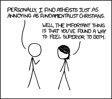
Like the last comic, I find this comic exceedingly boring. Unlike last time, I won't write on forever anyway.

We all know that atheism vs. religion has been a heated debate for a long time, and many of us probably have opinions on it. That's nice. There's a lot of comedy to be had in the debate - I think it's a result of the fact that both sides are so very passionate, so it's easy to turn that into very energetic, funny material. Anyway, the point is, there's a lot of stuff you could do to make fun of this debate, but this comic doesn't do it.

A guy named Filipe wrote me an e-mail about this comic, and he pointed out that you could replace "atheists" and "fundamentalist christians" with any other feuding groups and the comic would have the exact same joke. Twilight fans vs twilight haters; democrats and republicans; social scientists and hard scientists; nazis and minorities, (or, for that matter, xkcd fans and xkcd haters). The point is just about the nature of disagreement, in the abstract. It's getting all sorts of heated discussion, and, perhaps, added pageviews because he choose to use something nerds happen to enjoy arguing about. But when you actually stop and think about it (something so few xkcd fans seem to ever do!) there's basically nothing there.